-->

Monday 29 February 2016

Fantastic Voyage - Antibiotic thumbnails 1-15

Following on from my idea to utilize a WW1 aesthetic for my antibiotic designs. I've begun experimenting with possible designs for the little chaps.
 
I've tried to maintain an almost capsule like shape in their design, so that they are not completely removed from their function. I feel like this will help in the animation process, as they're not too complicated shape wise - though I might have to omit the scarf on #9 and #14, as while it looks pretty cute, It just adds further complication in the animation process.


I think I'll take a couple of these into sketchbook and play about with some colours, whilst also thinking on more designs. 

Sunday 28 February 2016

Fantastic Voyage - Bacteria #2 - Making him scary.

Okay, so I've worked on #2 a bit more, and he's definitely looking more ferocious, and definitely a lot more readable as an aggressor.

Friday 26 February 2016

Fantastic Voyage - Bacteria #2 further development


Here's a rejigged design based on feedback received, now that end one is mean lookin'. Out for antibiotic blood, or whatever constitutes that in the macroverse.

I honestly don't know why I thought stubble should go there, but I'm enjoying its presence nonetheless.

Fantastic Voyage - Bacteria #2 development


And, as I said earlier, I've developed one of the previous thumbnails a little bit; mainly trying to explore the notion of these things getting bigger and nastier, in order to whittle the antibiotics down.

Now, back to those mood boards!

Fantastic Voyage - Bacteria thumbnails 1-9

So, here's a few ideas for what my kaiju-esque bacteria could look like. I myself quite like 2, 5 and 8. And, time permitting, I don't see why I couldn't include a couple of different designs in the final animation, perhaps to show off different adaptations against antibiotics.

I want these things to kind of look benign, almost stupid looking creatures that don't really know what effect they're having, even though the effect is horrendous and destructive. So I've gone with a slightly vacant looking expression on each of them. I like the use of ungainly long limbs, and I feel like it makes them look kind of uncanny, and a little unsettling, but hopefully not too much, what with my chosen audience.

More are coming; currently working on a mood board in order to gauge what kind of colours I'll be using. And I've explored thumbnail #2 a little more, in terms of chronicling its growth as it adapts.

Anyway, to photoshop!

Cheers,

Crouch.

Fantastic Voyage - Target audience and research


Further to my extended reading into animation as a learning tool. It seems like something as engaging as an animation can do a lot of good in schools. In the Journal of Science Education and Technology, Miri Barak and Yehudit Judy Dori write... "that animated movies support the use of diverse teaching strategies and learning methods, and can promote various thinking skills among students. Findings also indicated that animations can enhance scientific curiosity, the acquisition  of  scientific  language,  and  fostering  scientific thinking."


I also found an interesting article discussing the "7 ways animation can help learning in the classroom", which reads almost like a mantra of do's and dont's - something I think could be quite useful as long as I don't take it as sacrosanct all of the time. In it, the idea of the "animated agent" is suggested, in that there is a familiar character that takes viewers through the animation with them. I think this is to suggest that children are more likely to keep focused on the animation if the teacher isn't there to do so.  I think there's scope to establish a narrator/guide character that will accompany viewers throughout the animation. Certainly if this is to be used as a teaching tool, then I should succumb to the very real idea that it should definitely engage children, everything else should be built around that ethos.


The article also discusses the notion of "no age barrier" on animation, it's just an interesting thought. One that could inform the decision to make my animation more universal if need be.


I'm working on some thumbnails now; I'm still pursuing the idea of merging a WW1-like aestheticism into the animation, for previously mentioned reasons. I've started the thumbnailing process, and have a few things prepared for a separate post that will follow this one.


Cheers,


Crouch.

Links


https://www.researchgate.net/publication/225262564_Science_Education_in_Primary_Schools_Is_an_Animation_Worth_a_Thousand_Pictures


http://www.innovatemyschool.com/ideas/item/997-7-ways-animation-can-help-enhance-learning-in-the-classroom


http://www.fractuslearning.com/2013/12/06/animation-in-the-classroom/

Depth of field, Radial Blur and Luma Key in After Effects


Quite interesting session today, I particularly enjoyed seeing how the culmination of these effects adds to the immersion in a scene.

Thursday 25 February 2016

Fantastic Voyage - The Beginning.

Apologies for the slightly late start blog wise, I've been quite possessed in imagining what I could possibly do for this brief. Thankfully, I have an idea, and I'll be following it and seeing where it takes me.

So, I'll begin by outlining the scenario I will be producing an animation for.

*Drum roll*

It's antibiotic resistance.

So yes, I've been trying to generate ideas for this scenario, And here's a few jottings from that process...


For you see, as Peter was talking about this battle between antibiotics and germs, an idea started to form, and initially I imagined the antibiotics to be the British forces, and the germs to be the German forces, the trenches becoming cell membranes and the antibodies becoming the air support. It also appeared, in my head, that this was a battle fought in WW1. I think something has stuck in my mind - perhaps from the fourth series of Blackadder with that absolutely somber finale - that relayed a hopelessness to the situation. Something, I think, that resonated with the idea that we will eventually run out of useful antibiotics.

Now, I think I got a bit scared of this concept, namely because I was pitting two humanoid forces against each other. (Possibly because I didn't want to depict Germans as Germs) But also because as Peter spoke, I imagined the relentlessness of the bacteria, how they're constantly adapting in this never-ending assault on the human body. This lead me down the trail of thought that the bacteria would in fact have to look more inhuman, more beastly and more of-putting to distinguish them apart from the Soldier/Antibiotics.

I looked on YouTube and found a couple of videos that seem to simply and concisely explain the process of antibiotic resistance, and also how antibiotics actually work in the body.


This was ideation and work done in Jordan's class on Wednesday. He's pointed me in the direction of the artist, Peter Chan, which I will mine for inspiration gladly.

Wednesday 24 February 2016

Soundscapes.

Thought I'd share my soundscape work as it's done. Really enjoyed the unexpected outcomes that these three edits presented. In some cases I found that I had started working on one images soundscape, only for it to turn into another's halfway through.


Tuesday 23 February 2016

Life drawing update, the tenth!


Once again, I've used those snazzy chalk pencils, and I'm really liking the result. I do think I should perhaps change it up next session, perhaps by using a water pen to smudge the chalk a bit. But that's for next time! 

I think some of these are really succesful. Particularly the first image, as well as some of the smaller poses in the second image. 


"Close Encounters of the third kind" (1977) - A review.

Fig 1.

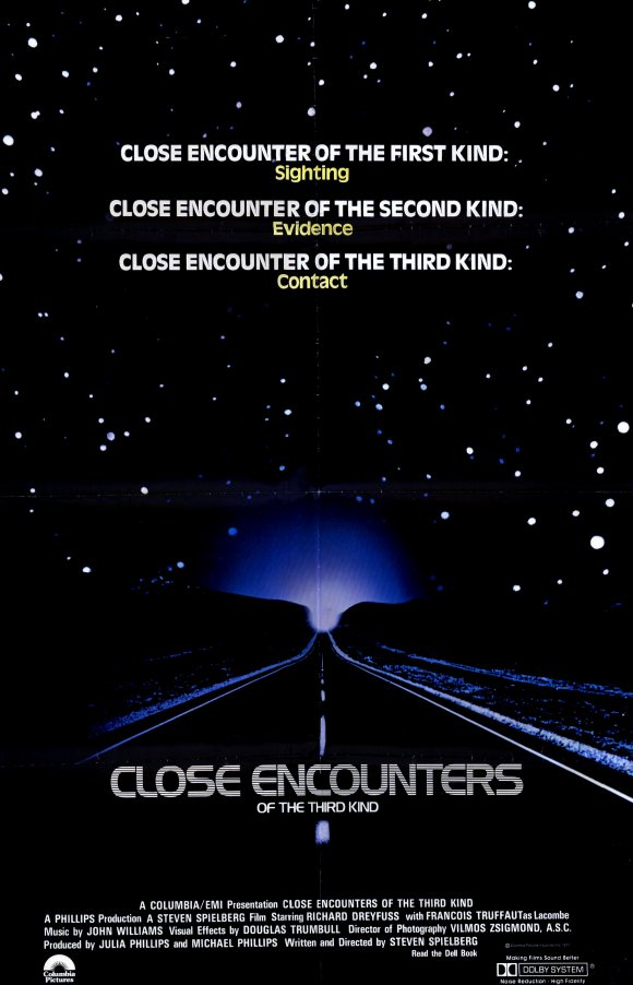
“Close encounters of the third kind” (1977) directed by Steven Spielberg recalls a spate of UFO sightings in Indiana. Centering on the everyman, Roy, and a single mother, Jillian, as they try to make sense of events after witnessing strange craft in the night sky. Their lives - once centered on their family quickly gets shafted for their quest for knowledge, and Jillian’s son, Barry.  

Fig 2. 
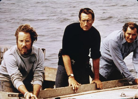
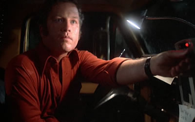
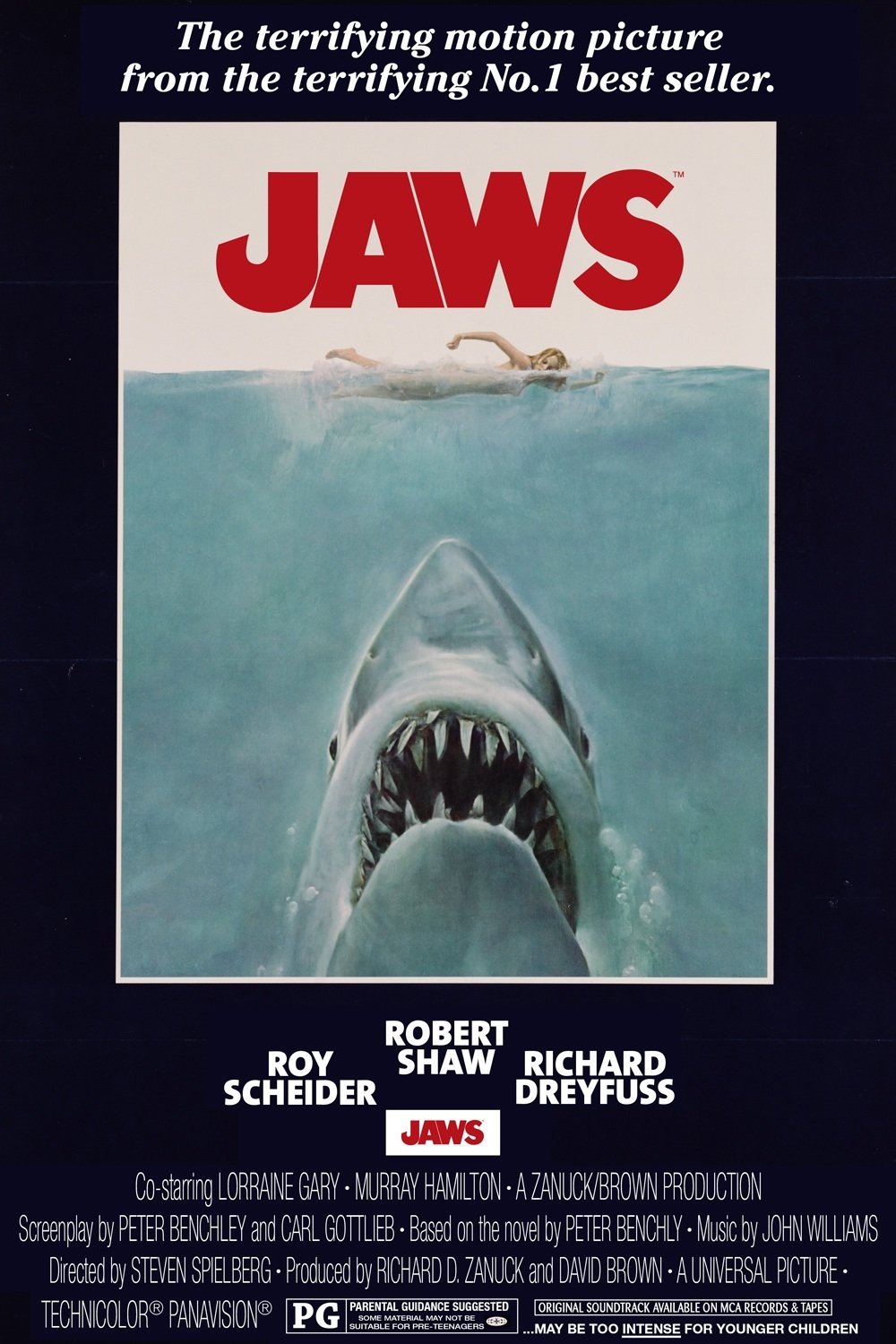
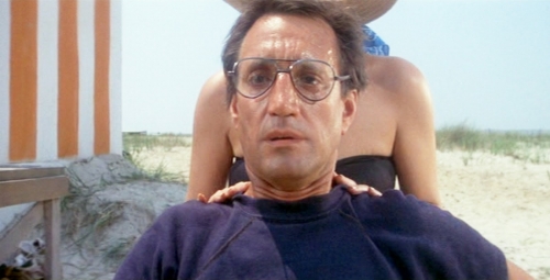
Again, as with Spielberg’s previous affairs, Jaws (1975) and Duel (1971), the narrative of masculinity and the role of a man, is explored. We are presented early on, within the doldrum of Roy’s life; reduced to a monotonous, and almost typically portrayed, family existence, wherein he seems as if going through the motions. We see Roy, struggling to live out his childhood vicariously through his children when attempting to show them Pinocchio, and in a particularly telling moment we hear his music box play “When you wish upon a star”, enforcing this idea of Roy as the dreamer, and an unfulfilled one at that. . Britt Hayes, writing for Birth. Movies. Death, states “he doesn't have a bad life, nor is it a particularly charmed existence, but he is stuck the way most of us are stuck in our daily habits, relying on that which has become second nature as if we're floating through the days on autopilot.” (Hayes, 2015) Indeed, once Roy has seen the alien craft and become obsessed with the shape/mountain, his pursuit almost treads on a certain romanticism with adventure. His excitement, and passions ignite at the sight of the craft, which serve as the vehicle in which the plot is driven forward. Yet, almost unsympathetically, Roy leaves his/is left by his family whilst on his quest for understanding. Spielberg is shows honesty in his portrayal of the modern family, and also in the portrayal of a genuine reaction to preternatural events; Hayes goes on to state, “It's a feeling that has no word to describe it nor definition. So much of Close Encounters of the Third Kind is about actual feeling and genuine response, forgoing the usual plot patterns and generic representations of how human beings should respond.” (Hayes, 2015). Continually, it seems, Close Encounters does the opposite of what is expected. Our two characters, instead of crumbling at the loss of family, band together in their own ad-hoc family, forged by spectacular events. And in many ways, this opposite action, the going against of the expected typifies Close Encounters of the third kind.

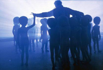
The idea of broken families stems from this, but Close Encounters curtails this by being almost redemptive in its ending, when Roy joins a new family. His reward for following his dreams, admittedly at the exclusion of his blood family.  Writing for Rogerebert.com, Jim Emerson suggests that by the end...“Roy and Elliott to [re-]discover the meaning of "family" (and "empathy").” (Emerson, 2010)

Fig 3. 

Stylistically, Spielberg utilises skills shown in previous efforts to maintain a certain level of tension throughout the movie, in some parts actually framing scenes within the tropes of horror, this is best seen when Barry is taken from Jullien. There’s a deliberacy in the pacing of this scene that suggests imminent horror, and indeed the very act of her son being effectively stolen from her is a harrowing ordeal. Which is why the ending is perhaps so effective, for it flips the expectation that these alien beings will start killing and destroying things. It’s an almost non-payoff payoff, where instead of an orgy of death and destruction, we find that the aliens are somewhat like us. It’s almost disappointing in a superficial way, but the more it is ruminated upon the more powerful an ending it seems.

Bibliography

Hayes, Britt. “CLOSE ENCOUNTERS OF THE THIRD KIND Remains Singularly Strange And Genuine” Birthmoviesdeath.com [online] Available at: http://birthmoviesdeath.com/2015/09/17/close-encounters-of-the-third-kind-remains-singularly-strange-and-genuine [Accessed 23/2/2016]

Emerson, Jim. “MAKING CONTACT: SPIELBERG'S CLOSE ENCOUNTERS AND E.T.” rogerebert.com [online] Available at: http://www.rogerebert.com/scanners/making-contact-spielbergs-close-encounters-and-et [Accessed 23/2/2016]

Illustrations

Fig 1. Close Encounters of the third kind poster [image] Available at: http://cdn.fontmeme.com/images/close-encounters-of-the-third-kind-poster.jpg

Fig 2. Roy looks up [image] Available at: http://www.themoviescene.co.uk/reviews/_img/4863-2.jpg

Fig 3. Roy’s new family [image] Available at: http://www.daviddarling.info/images/Close_Encounters_of_the_Third_Kind.jpg


Monday 22 February 2016

Thursday 18 February 2016

"Ziggy" - Finished Animatic.


Here's the rescored version of my animatic. Got to dash, more work to do. Looking forward to showing it off though, See yáll on the morrow.

Cheers,

Crouch.

"Ziggy" - Animatic


Here's the current animatic for "Ziggy". Really happy with this, image upscaling issues aside.

I don't know if It's a cop out by utilising "Blue Danube" for the score, initially I had put it there as a placeholder to edit to, but increasingly I found that it just worked so well that I couldn't bare to remove it.

Thoughts appreciated.

Cheers,

Crouch.

Wednesday 17 February 2016

"Ziggy" Presentation storyboard


So, here's my completed, revamped, brand spanking new storyboard. I've taken a lot of care in adding in shots to give greater resonance to the events that unfold in "Ziggy", as well as - well - a lot of care generally.

Pretty shortly this will be turned into an animatic. I've got a rough idea as to what I want to do with the sound design.

Anyway, on the home stretch now. Once all is done, I look forward to treating myself with Deadpool on the weekend.

Ciao,

Crouch.

Sunday 14 February 2016

"Ziggy" - Ziggy's space suit.


And hot on the heels of my last post, here's Ziggy's space suit! 

Getting used to using the Cintiq now. Now I'll be moving onto the environment, hopefully having a portion of the space shuttle worked out by the end of today. 


"Ziggy" - Grappling hook development


Not forgetting the prop that needs to be included in "Ziggy", here are some designs for the grappling hook that will eventually be used to save my heroes lives.

I'm leaning towards the simpler shapes. Imagining the devices to be quite chunky, cumbersome guns. As you can see, there are certain shapes which I have favored and as such are repeated a few times. I particularly enjoy the design of 11 and 12.

Saturday 13 February 2016

"Ziggy" - Fuzz Space suit design.

Big news, I got myself a Cintiq. 

And these are the first images I've got from it! 

Yes, Fuzz and Ziggy needed space suits! So here is Fuzz's, replete with a tiny deviation from their usual design - blue stripes down the arms and legs. 

The good news is that I'm finding the new tablet easier to work on. So, Ziggy's suit, The grappling hook and the environments. Big day tomorrow then :) 


"Jaws" (1975) - A review.

Fig 1. 
Jaws” (1975) by Steven Spielberg centers on the small coastal town of Amity, and more specifically the tyranny of one rogue shark. Events hit fever pitch as Amity’s police chief, Brody - one of the only town officials concerned with the vicious attacks - struggles against the Mayor of Amity, a stubborn man who obsesses over cash generated by Amity’s tourist industry and the loss of it, should the truth of the increasing shark attacks shut down the beaches. Brody, along with Hooper - an oceanographer - and Quint - a shark hunter - embark on a mad quest to track the rogue shark down and put an end to its killing spree.

Fig 2. 

If Spielberg’s earlier film “Duel” (1971) was an exercise in amplifying our fears of the road then “Jaws” continues this fascination, turning its gaze to the ocean and mining our fears of what lies beneath. “Jaws” continues Spielberg’s exercises in Alfred Hitchcock’s own tradition. Roger Ebert discusses that “Spielberg leaves the shark under the table for most of the movie. And many of its manifestations in the later part of the film are at second hand: We don't see the shark but the results of his actions” (Ebert, 2000). It’s a narrative bait and switch that keeps the audience fretful at the uncertain notion of the killer. Indeed, in not being gratuitous in how the shark is featured, Spielberg keeps any and all tension tightly contained within the frame, as we are forced again and again to confront the ocean. This is felt and seen most abundantly towards the end when Brody, Quint and Hooper are leading the shark back to shore, only we are never directly shown the shore. Always, Spielberg directs his gaze outwards towards the open sea, never letting the audience see how close the characters are to the shore, and to safety. Another scene which is particularly effective in ramping the tension features two would-be shark hunters - after the reward for killing the monster shark. They bait a large hook, attach it to the jetty they’re on and wait for the shark to bite. When it inevitably does, it drags part of the jetty with it causing one of the men to fall into the water. The jetty - now attached to the shark - initially moves out to sea, but quickly turns about to give chase. I mention this scene because not once do we ever see the shark, we only see the jetty floating on the surface. These scenes and others like it lend themselves to the final reveal and make it that much more palpable.

Fig 3. 
To talk about “Jaws” is to then acknowledge the subtext at play, to start with, Spielberg’s earlier themes of masculinity and impotence rear their head once again. It is perhaps, interesting to note that of the three male leads, there is no archetypal “macho” man amongst them. Brody is openly afraid of the water, Hooper is squeamish and Quint - arguably the closest to that archetype - has underlying mental damage brought on by surviving a horrific stint at sea during the second world war. Indeed “Jaws” is as much about these men killing the shark, as it is killing their demons, chiefly in Brody’s case. There’s a particularly warming scene that further builds on this theme, where the three men all share a moment of respite together, get drunk and share stories about how they received certain scars. “Hooper and Quint trade stories. This one from a moray eel. That one from a thresher shark. Brody has nothing to contribute to the conversation, although he considers sharing his appendectomy scar before deciding against it. (Bitch Flicks, 2015) For it is with Brody that the greater change occurs. “Chief Brody (Roy Scheider) begins the movie as the epitome of American manhood, almost to the point of cliche. He’s a loving husband, a devoted father, and a solitary lawman protecting his community. When confronted by the shark, however, everything spirals out of control” (Belinkie, 2010) Of course, being in a position of power and being powerless to do anything takes it’s tole on Brody. And then something interesting happens. Brody stops being a man and goes back to being a child. He’s taken out of the context of his family and community, and put on the Orca, where he’s completely out of his element” (Belinkie, 2010). It seems as if away from the powerlessness he experiences on land, Brody finally learns to have some form of agency on the Orca, through learning with Hooper and Quint and overcoming his fear of the sea he regains some semblance of agency.

In short, “Jaws” builds on Spielberg’s earlier themes of impotence and to an extent the castration complex, positing the place of men in society and their changing fascias amidst great societal change. The technical aspects marking “Jaws” as a complex narrative that picks up the gauntlet laid down by Alfred Hitchcock in terms of tight control over the way in which exemplary cinematography can induce dread, terror, and box office success.

Bibliography

Belinkie, Matthew. “You’re Gonna Need a Bigger Phallic Symbol: Jaws As a Journey from Impotence to Manhood” overthinkingit.com [online] Available at: https://www.overthinkingit.com/2010/06/03/jaws-impotence-manhood-phallic-symbol/ [Accessed 13/2/2016]

Bitch Flicks. “I Think We Need a Bigger Metaphor: Men and Masculinity in ‘Jaws’” Btchflicks.com [online] Available at: http://www.btchflcks.com/2015/06/i-think-we-need-a-bigger-metaphor-men-and-masculinity-in-jaws.html#.Vr5wevKLTWI [Accessed 13/2/2016]

Ebert, Roger. ‘Jaws review’ rogerebert.com [online] Available at: http://www.rogerebert.com/reviews/great-movie-jaws-1975 [Accessed 13/2/2016]

Illustrations

Fig 1. Jaws Poster [image] Available at: http://ecx.images-amazon.com/images/I/71CTreJGV5L._SL1500_.jpg

Fig 2. Three men on a boat [image] Available at: https://monsterawarenessmonth.files.wordpress.com/2011/02/jaws_172703s.jpg

Friday 12 February 2016

Flash - Flirtatious Blimp, Coloured.


So, here's my blimp, coloured, and I've improved the cycle on the animation so it actually flows, I've also embraced the roughness of my initial linework, and Meg seems to like the direction I've taken this.

Next thing to do is colour the cloud in and include some dribble coming out of the blimp's mouth.

Flash - Flirtatious Blimp update.


I've made headway with my "Flirtatious Blimp" with plans to colour the cloud and the blimp, as well as add another sequence where the clouds get revenge! I also want to add the spittle from the Blimp, perhaps where it lands etc... 

I think I've nailed a certain odiousness within the blimps gestures towards the clouds, which I am quite happy with :)  

Thursday 11 February 2016

"Ziggy" - Waxworks Worker design

So, working up the placeholder characters in my storyboard had proved successful with the other characters, each leading me to something different or modified from what I initially imagined, and I certainly went along this route for the Waxworks Worker. I imagined this kind of greasy teen, not particularly odious looking; instead being this  "living in his Mum's basement, going out partying on the weekend, heavy metal listening" kind of guy. 


So I went down that route, yet as I was drawing him I quickly grew dissatisfied with his design. And into my head popped a scruffy looking round fellow. Cheerful and unassuming. Someone content in minding his own business, kind of just waddling along as he worked. It almost felt as though I was drawing something half remembered, and as he appeared I saw fit to give him a name, which initially he would not have had.

So, here's Steve, the Waxwork guy.

"Ziggy" - Mother, colour comps.


So, all in all I'm really happy with how these have turned out, I feel like I've achieved the glee that the Mother character shows when encountering the Fuzz display. To top that off, I think I've achieved something which I wasn't capable of at the start of this course, which is to draw convincing female characters, and to an extent, draw characters at all.

So, I'm faced with 4 choices. Personally, I really like number 1, and it's how I've imagined this character looking from the start. But having said that, there's merit in the other choices too. Option 2 with the cream jumper is really evocative of the 80's in my mind. And there's something about that red jumper in number 4 too.

Decisions decisions.

Anyway, one more character to plot out after this. The ball is rolling!

Wednesday 10 February 2016

"Ziggy" - Mother, character development

To design the boy's mother then...

I began to experiment with what sort of character I wanted the mother to look like during the storyboarding process. And after receiving feedback about it, it became clear that I had to imbue her with more aesthetics from the 80's. 


So, straight off I formed a mental checklist of what that could be and came up with big hair, big jumpers, big glasses and "Mom Jeans". 

The first result (the character on the left) left much to be desired, for I feel like I had created the boy's younger sister instead of his mother. So I tried again, hiding the midriff and straightening the trousers out - as well as getting rid of that sassy pose.


I felt quite happy with the addition of glasses and to a greater extent, the "big hair" - which was mainly inspired by this image. 


So, I played around with the pose again, and presto!...


So, onwards to the colour comps! :)