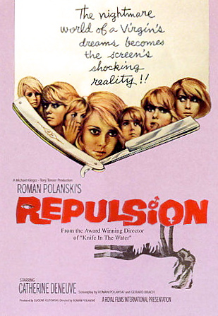
-->

Monday 30 November 2015

Gyro - Blocking stuff out in Maya.


Breakdown
Planning the shot.

So I've made a couple of the buildings require for the final composition and I think I've got the UV's working nicely at this point, however, I'm in two minds as whether to keep these structures low poly so as to reinforce their shard-like appearance and also to be in-keeping with the style set out in my concept painting. I asked Simon the same question he recommended I try it that way and see how it comes out, which I intend to do.

Tonight, I'll be experimenting with different lighting and how it affects my buildings, As in parts of the concept painting there is quite a soft light, so I'm hoping achieving that won't muck anything up with my UV's or anything.

I was a little unsure with the process, but I've resolved to use planars on each surface without stitching them together. I think this will probably produce anomalies along the edges of the buildings so I shall see how it goes. Maybe I'm overcomplicating the process in my head, maybe I'm not.

Anyway, More stuff soon :)

Sunday 29 November 2015

"The Shining" (1980) - A review.


Fig 1.
The Shining” (1980) by Stanley Kubrick recounts the preternaturally charged tale of the Torrence family and their encounter with the Overlook Hotel as a storm begins to take hold, trapping them. Featuring Kubrick’s trademark pacing and an almost microscopic attention to detail “The Shining” beckons viewers into the isolation of the Overlook, but within they will find that once inside and safe from the storm, they are instead trapped again, within the often times confusing and labyrinthine, Overlook. Of the plot, Roger Ebert muses... “Who is the reliable observer? Whose idea of events can we trust?” (Ebert, 2006)


The drab art direction within the hotel exploits a different kind of horror, the kind that you don’t encounter when running from a crazed axe-murdering interdimensional hyper lizard named Chuck. Instead, it is the kind that features in our everyday lives. Kubrick states - when discussing the conception of the art direction for the hotel -  “We wanted the hotel to look authentic rather than like a traditionally spooky movie hotel. The hotel's labyrinthine layout and huge rooms, I believed, would alone provide an eerie enough atmosphere.” (Kubrick, 1980) The Overlook Hotel is pristine, in a hospital-like manner, in which the appearance of cleanliness is upheld, but there is a sense of history - a build up of it - accumulated over a span of time, lending an eerie and in fact, unsettling quality to proceedings.


Kubrick’s camera work is exemplified in The Shining, the long steadicam shots adding a fervent dread to the claustrophobic halls. Tracking shots follow Danny through hallways, holding him at an uncomfortable distance to instill in us a sense that something is slyly pursuing him. This sense of unease is further driven home by the disparity featured in the spacial design of the Overlook. There are instances in the film where spatial continuity is marvelously broken, for instance the window in Ullman's office that features an open sky where a hotel wall should be blocking; hallways that have no logical endpoint as the hotel doesn’t continue with the, indeed the interior of room 237 encroaches upon the area where another room should exist, giving rise to ideas of a fractured reality where nothing makes sense; executive producer Jan Harlan says of the design…”It's clear instantly there's something foul going on. At the little hotel, everything is like Disney, all kitsch wood on the outside – but the interiors don't make sense. Those huge corridors and ballrooms couldn't fit inside. In fact, nothing makes sense.” (Harlan, 2012)


Fig 2.
In broad terms, it is the culmination of these things that creates the presence of the Overlook, it is seemingly imperceptible; even Wendy doesn’t seem to notice the oddities that Jack and Danny encounter, but as with Repulsion (1965) and Black Narcissus (1947) these techniques go to build the atmosphere until it is almost made flesh. The Overlook is perhaps the most evocative of the trio, becoming iconic and almost archetypal in its mundane depiction of supernatural horror in a largely normal setting.


Fig 3. 

Bibliography

Abbott, Kate. 'How We Made Stanley Kubrick's The Shining'. the Guardian. [online] Available at: http://www.theguardian.com/film/2012/oct/29/how-we-made-the-shining [Accessed 29 Nov. 2015]


Ebert, Roger. 'The Shining Movie Review & Film Summary (1980) | Roger Ebert'. Rogerebert.com. [online] Available at: http://www.rogerebert.com/reviews/great-movie-the-shining-1980 [Accessed 29 Nov. 2015]


Visual-memory.co.uk,. 'The Kubrick Site: Kubrick Speaks In Regard To 'The Shining''. [online] Available at: http://www.visual-memory.co.uk/amk/doc/interview.ts.html [Accessed 29 Nov. 2015]


Illustrations


Fig 1. The Shining Poster. [image] Available at: https://girlmeetsfreak.files.wordpress.com/2012/10/the-shining-1980-poster.png [Accessed 29 Nov. 2015].


Fig 2. Danny on trike - still. [image] Available at: http://idyllopuspress.com/idyllopus/film/images/shining/sh_tu5.jpg [Accessed 29 Nov. 2015].


Fig 3. Jack at the bar still [image] Available at: http://www.beatontheblue.com/wp-content/uploads/2013/09/JN-shining.jpg [Accessed 29 Nov. 2015]


Additional reading


Additional viewing


https://www.youtube.com/watch?v=0sUIxXCCFWw - Spatial awareness and set design in "The Shining".


Friday 27 November 2015

Flash - Dancing. Or something.

So here is a snapshot of where I'm at with this animation, it's still a long way off.

I'll aim to have this done over the weekend, and try to keep the figure from looking too drunk :P

Flash animation - Bouncing dinosaurs.


Just in time for The Good Dinosaur!


Wednesday 25 November 2015

Gyro, the final composition?


Cool!

So, here's another updated version of the concept art for Gyro, taking into full consideration the direction from Phil and Jordan.

It'd be lovely to hear some thoughts on this, I've gone a bit snowblind, so to speak.

I'll be posting the breakdown soon :)

Maya tutorial 06 - I've finished the Old Alley!


It is done!

I really enjoyed the challenge that this alley posed.

Now it is high time I started building Gyro!

Life drawing update, the fourth!

I rather enjoyed this week's life drawing session. 

Next week I'm aiming to come out of my shell a bit more and attack the page with colour! Vikki has encouraged this.

For now though, I thought about the way I could increase the dynamism in these drawings through photoshop. Here's some of that. 

Ciao. 


Monday 23 November 2015

Gyro, post OGR composition update.


So I've got a tad more to do, but I thought I'd share my progress, as it's getting close to 12, I should be asleep.

Anyway, on reflection on the advice given on the OGR from Phil, and further advice from Jordan, I'm now trying to instill a sense of depth within my scene.

This definitely works better than my last go at things! and I know what I need to do to further improve the shot. Now I must do it!

(Fear not, the car will be dealt with! :) )


I've also made use of the colour lookup feature which Jordan demonstrated to me today. I'm quite pleased with how it can subtly affect the colours without changing them too much, in comparison with the gradient fill tool which I feel to be a tad more dramatic in it's use and parameters.


Sunday 22 November 2015

Maya Tutorial 06 - Lighting the set


Apologies for it being a bit dark.

I'll fix it in post. Or now, I have that power :P

Anyway, I'm nearly there, the home stretch! I'll have this alleyway textured tomorrow for sure! :)

Friday 20 November 2015

"Repulsion" (1965) - A review

Fig 1.


Repulsion” (1965) by Roman Polanski recalls a tale of an affected young woman struggling with societal expectation; interactions which are normal by definition, but to Carol Ledoux, catastrophic. Rupturing her faculty with terse and often terrifying consequences that effectively “spill over” into her real world perception and pummel the viewer with a visual metaphor smorgasbord that weaves with clever ambiguity the story beyond what is seen.

Repulsion is remarkable in its time for putting women at the forefront amidst a backdrop of sexual revolution, providing in it’s microcosm, heightened yet honest examples of women living in the midst of an awakening, and in particular the strife and anger at the men that perpetuate a form of perceived oppression. Indeed, we are treated to scenes of Carol walking to and from work, keeping herself to herself, but falling foul of various male characters along the path. Through this, she never looks pained in any way, and no dialogue is spoken, we are subject to an impassioned drumming, quickly outstaying its welcome and hammering home the social assault Carol suffers. Elaine Macintyre somewhat cooley explains...“No wonder Carol, passive and listless as the dead rabbit, feels that women are nothing more than pieces of meat to be used and abused. And why her fractured mind revolts at the idea as, all the while, outside, a tolling bell calls nuns in a neighbouring convent to prayer, perhaps symbolising a straightforward purity that poor Carol, trapped in the disordered mess of her flat and her mind, can only yearn for.” (Macintyre, 2014) Much of the tension comes from these interactions with male characters, something which seems to send Carol closer to the edge, until she, in layman's terms, trips the hell out. Imagining cracks in the wall - the cracks in her psyche - broad hairy arms groping her in the hallway, rape hallucinations. It becomes so much for Carol that she cannot stand any interaction with men and rationalises that murder is the better option, something she instantly regrets.  Interestingly her sister is an example of a woman at ease with the way of things, and within the bubble of Repulsion, provides a captivating juxtaposition which causes background tension between the sisters, but also adds to the outer story the film only hints at.
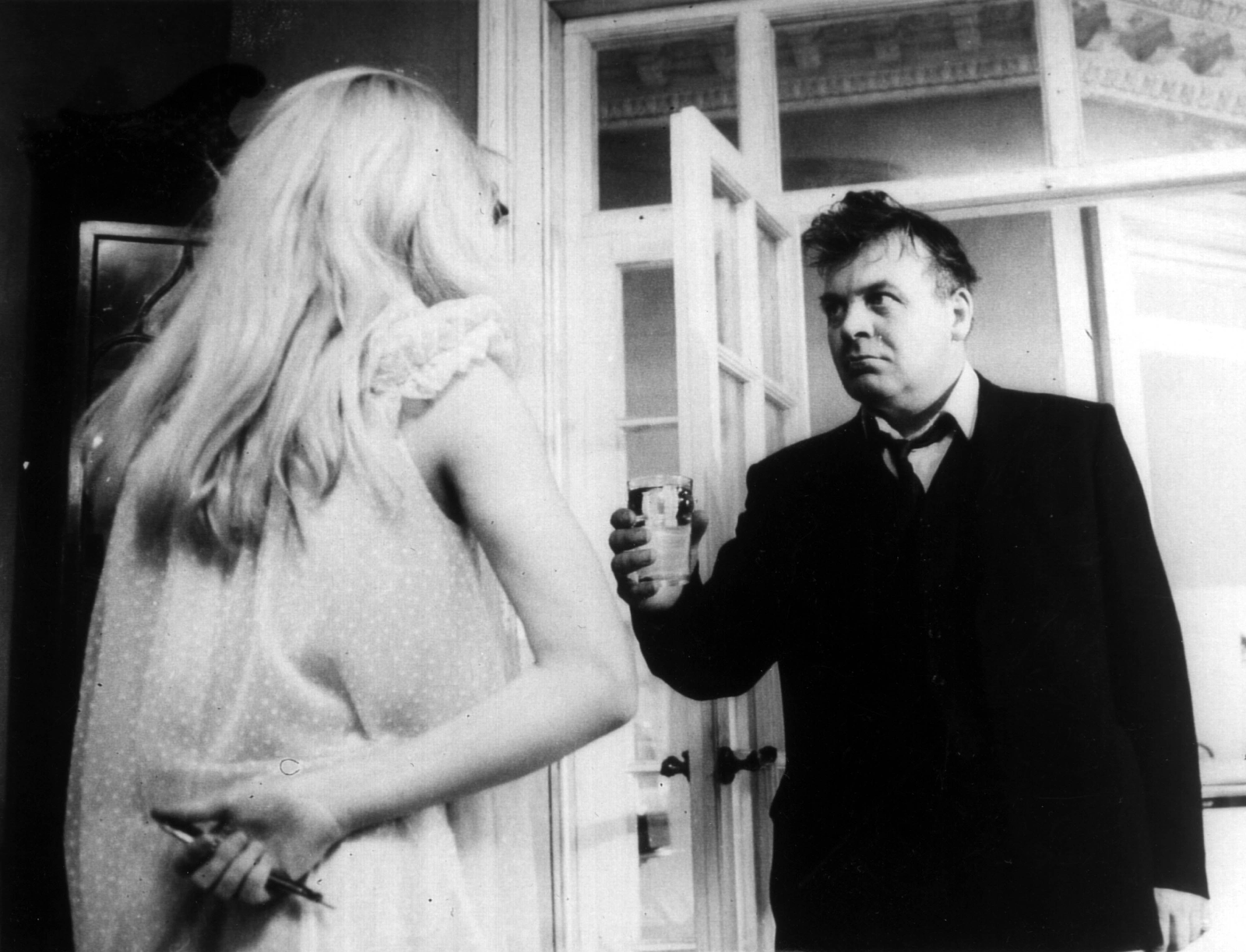
Fig 2.
Its aim seemingly to arrest the viewer and truly make them accustomed to the neurosis of Carol - Something that is made worse when her sister goes on holiday, leaving her alone to her paranoia and claustrophobia - This is achieved via the mise en scene and the soundscape, each working together to truly ram home these bouts of lunacy. Within these bouts lies the magic of the film, as once again, mental degradation is reflected outwardly,  “Not only are the walls closing in, but they're crumbling, cracking, reaching out to grab her and turning to porridge beneath her hands(Macintyre, 2014) Indeed, Polanski keeps the film on a tight leash, the pacing being that of a meandre, shots that force the audience to stare at Carol when in deep catatonia, reinforcing the pervading sense of seclusion.
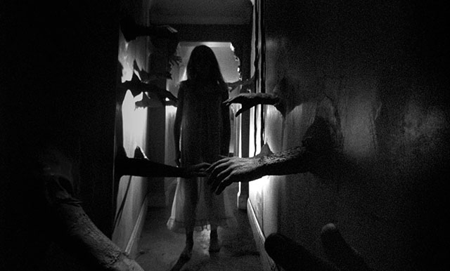
Fig 3. 


As with Black Narcissus, a film very much of the same ilk as Repulsion, the narrative reins are held firm until the third act, when the horses bolt. “Polanski manages to convey Carole’s descent into madness, in a way that invites audience inside her head even while giving viewers the creeps. Much of the imagery is memorably revolting (a rotting rabbit) or surreally disturbing (hands emerging from the walls to fondle the hallucinating woman).” (Biodrowsk, 2009) The surrealness of the art direction mantles a chilling presence, a palpable force that, in this instance, is meaningful in the way it is used to convey a certain state of mind.


Repulsion is not an easy film. It is not a film one would watch surrounded by family on a sunday evening, eager to chill out. But it is an important film, in both its examination of gender issues and its ease of conveyance of a state of mind which would otherwise be inaccessible were it not for it’s nightmarish art direction and powerful visual metaphor.  

Bibliography


Biodrowski, Steve. 'Repulsion (1965) – Horror Film Review'. Cinefantastiqueonline.com [online] Available at: http://cinefantastiqueonline.com/2009/07/repulsion-1965-horror-film-review/ [Accessed 20 Nov. 2015]


Macintyre, Elaine. 'Cult Classic Film Review: Repulsion'. Elainemacintyre.net. [online] Available at: http://www.elainemacintyre.net/film_reviews/repulsion.php [Accessed 20 Nov. 2015]
Illustrations

Fig 1. Repulsion Poster. [image] Available at: https://upload.wikimedia.org/wikipedia/en/8/89/Repulsion_(1965_film_poster).jpg [Accessed 20 Nov. 2015].


Fig 2. Carol and the Landlord. [Image] Available at:
https://twentyfourframes.files.wordpress.com/2013/08/repulsion3.jpg [Accessed 20 Nov. 2015]


Fig 3. Carol and the arms. [Image] Available at:
http://deeperintomovies.net/journal/image14/repulsion6.jpg [Accessed 20 Nov. 2015]

Further reading

http://www.huffingtonpost.com/kim-morgan/roman-polanski-understand_b_301292.html

Sketchbook perspective tool practice.


This program is fantastic! I can definitely see it helping when developing compositions.

In relation to the feedback I received from the last OGR in terms of making my work busier and more dynamic, I can definitely see this tool playing a role in helping me achieve these goals.

Very cool!

Thursday 19 November 2015

Gyro composition breakdown.


I am both tired and pleased at the same time. There's probably an obscure Norwegian word for that feeling.

What if? Metropolis - OGR part 2 18/11/15


Phew!

That was a hard day's work, But I'm happy and hopeful this time around!

(Also I have no idea why it's cutting the bottom off in some slides as the PDF is fine)

Artist's Toolkit links

http://tromacorp.blogspot.co.uk/search?q=maya

http://tromacorp.blogspot.co.uk/search?q=life+drawing

http://tromacorp.blogspot.co.uk/search?q=review

http://tromacorp.blogspot.co.uk/search?q=flash


Wednesday 18 November 2015

Gyro composition progress.


I've scrapped the "painterly" qualities in favour of a minimalist style to further reflect Balla's style. I feel as though It helps form the dynamism of Gyro to a fuller extent.

I've also scrapped the original spiral track in favour of a more freeform shape. I'll now spend my time illuminating it, placing a car and driver in view, and finalising the left side of the composition, as it doesn't quite work yet.

Tuesday 17 November 2015

Gyro composition experimentation, feedback needed.

So I've chosen a thumbnail to pursue development on as I was quite taken with the framing, and the ability to showcase all that Gyro had to offer. 

I'm a little unsure on setting the shot in daylight, though It seems as though to set it at night would be at odds with the colour choices Balla uses, as he works mainly in very bright settings. But I definitely feel as though this shot would be better and showcase the danger/beauty aspects of Gyro a little more if set at night.

So, yeah, it's still in progress more or less.


Monday 16 November 2015

Gyro, Shard experimentation thumbnails + colour comps 122 - 153

Now I have begun to think about the skyline of Gyro, and further to the point I made last post re - modular landscapes/buildings, I have postulated that these buildings or "Shards" would effectively plug into uniform shaped cradles so as to maximise the difference in buildings at any given time.

I will be experimenting further with this as to me, it is an idea too silly and big, not to explore.


The first set of buildings will serve as housing structures, whereas I intend the second batch to serve as boutiques and "vertical bazaars". Later on I will incorporate further things to signify this distinction. 

Anyway, back to it! 

Gyro Thumbnails, 101 - 121


I am particularly happy with thumbnail #102 and am continuing to develop it to further realise the city of Gyro. To this end I have tried to focus on the modular nature of Gyro, as seen in #103. 

I do feel as though I am closer in capturing the energy and excitement of Gyro, though there is indeed more work needed, In particular I would like to focus on the non-euclidean nature of the space, as well as showing the bustle and spectacle as described in my travelogue. 

I'm also trying to incorporate Giacomo Balla's trademark sense of movement that he incorporates in his pieces, sometimes positioning chunks of a rotated view on to the front view of something, sometimes breaking down the movements of something so as to view it almost frame by frame, in a single frame. 

I'm getting there though. I'm really digging the idea of the speedways being the main source of spectacle, I think that if Gyro is to be remembered for anything it is for it's racing, and therefore I need to do something bloody great to realise this.


Although there are definitely some weak structures here, I do enjoy #107, #114, #115, #118 and #121. And feel as though they are certainly not strong enough to be main buildings within Gyro, but could definitely serve as part of a modular system of buildings seen around the city. 

More to come!


Gyro Thumbnails, 74-100


New stuff inbound!

It's an exciting time to be around on a monday night folks!

I'll have a couple more of these posted tonight, as well as some shot development, building ideation and definitely no Dinosaurs!

Feedback and comments are encouraged and appreciated as always :)

Friday 13 November 2015

Dinosaurs are cool! (Flash progress)

Yes,

It was inevitable.

Here's that ball I animated a while back, and I as I said, I could not resist turning it into a dinosaur.

Not only that, but an extremely bouncy baby dinosaur.

Now, for next week I've got to make a background for this chap, and also colour him in. It's all rather fun!

Thursday 12 November 2015

Life drawing update


5 Minute studies
1 minute studies (to be used in tomorrow's class with Meg)
20 minute studies

Quick sketch of a jolly - actually I don't quite know what he is...