Friday 30 October 2015
After Effects logo animation
Weight, time and movement in Flash.
Moving on from the morphing tutorials from the previous session, we were tasked with portraying a convincing representation of weight, time and deformation within Flash.
 |
| Weight and deformation. |
 |
| Weight and deformation with secondary object. |
I wasn't obsessed with them before this course, honest :)
Thursday 29 October 2015
Friday 23 October 2015
Perspective exercises.
So, these would come at the start of a project right?
Well, why did I upload them at the very end of the project?
For that conundrum, I have no clear answer.
Here they are! :)
Well, why did I upload them at the very end of the project?
For that conundrum, I have no clear answer.
Here they are! :)
Life drawing, 3 week update.
 |
| Study of structure. |
 |
| Negative space within structures. |
 |
| Quick sketches. |
 |
| Drawn without taking the pen away from the paper, and under instruction not to look at the paper too much. |
 |
| The first batch of quick sketches. I could feel my arm wanting to fall off at one point :P |
 |
| 20 minute study |
 |
| Last sessions quick sketches, I love some of these. |
 |
| I didn't mean to cut his head off, but there it is. There's probably some kind of subtext there that I'm wholly unaware of :P |
Sorry about the spuddy quality on a few of these, (They're all photos taken in horrible lighting, my mistake).
Over the three weeks I can track a marginal improvement in my drawing skills. I'm actually itching to get some more life drawing sessions in!
The Art of Despina
I am tired now.
Looking forward to talk about this stuff tomorrow....wait...today. Yeah, looking forward to talking about this in a few hours :)
Despina, Resolved high angle shot.
I'm really glad I took the advice given about this piece, it's my favorite out of the three that I have attempted.
Despina, Low angle exterior shot.
I am suffering from a bit of a mad rush. But there's still a lot of merit to this composition. I like how it adds to the mythos of Despina, showing it's trading roots, eclipsed by the mega structures of the shard buildings.
Thursday 22 October 2015
Despina, Interior shot development
Despina always felt a little bit shady to me, a place to make connections. A vertical Mos Eisley reaching towards the stars.
I'm quite happy with the composition as a whole, though I do feel as though the right side could do with some work as it's looking a bit flat. I also think it could look busier, hopefully I can achieve that before tomorrow!
Wednesday 21 October 2015
Despina, High exterior shot development
So I think it time to share my take on Despina.
After reflecting on the critique gained from the OGR, I thought hard about what Despina should look and feel like, trying to use the text in a more faithful way than I had previously.
Phil mentioned the windjammer like quality of Despina is at odds with it's almost industrial, chimney adorned description. So I have tried to capitalise on that, and I hope I have!
At first I began to experiment with the placement of the chimney's, at one point certifying that they would form a ring around Despina, covering the lower levels in smog and soot. This immediately brought forth ideas of fresh air being a commodity; Notions of higher and lower classes vying for clean air within the desert city of Despina.
I took quite a shine to the shape of #3, feeling as though it was a craft about to take off. Using that notion I played around with the shape a bit, and ultimately laid the shape down, so as to act as a floor plan for a city.
This is when I began experimenting...
Image #4 became the basis for my side view, I really tried to hint at the form of a ship,even going so far as to add a giant solar sail in the middle of the city.
I took these images as sacrosanct and went into Maya to model Despina, in order to achieve a greater sense of perspective for my helicopter shot.
Then I thought, it's do or die! so I threw myself into the painting process, experimenting with colour, to achieve an earthy and desolate appearance, as well as to impact some sense of scale on the piece, without having any human element present. (If that's a good idea, remains to be seen.)
Ciao.
After reflecting on the critique gained from the OGR, I thought hard about what Despina should look and feel like, trying to use the text in a more faithful way than I had previously.
Phil mentioned the windjammer like quality of Despina is at odds with it's almost industrial, chimney adorned description. So I have tried to capitalise on that, and I hope I have!
At first I began to experiment with the placement of the chimney's, at one point certifying that they would form a ring around Despina, covering the lower levels in smog and soot. This immediately brought forth ideas of fresh air being a commodity; Notions of higher and lower classes vying for clean air within the desert city of Despina.
I took quite a shine to the shape of #3, feeling as though it was a craft about to take off. Using that notion I played around with the shape a bit, and ultimately laid the shape down, so as to act as a floor plan for a city.
This is when I began experimenting...
Image #4 became the basis for my side view, I really tried to hint at the form of a ship,even going so far as to add a giant solar sail in the middle of the city.
I took these images as sacrosanct and went into Maya to model Despina, in order to achieve a greater sense of perspective for my helicopter shot.
Then I thought, it's do or die! so I threw myself into the painting process, experimenting with colour, to achieve an earthy and desolate appearance, as well as to impact some sense of scale on the piece, without having any human element present. (If that's a good idea, remains to be seen.)
Here's what I've got so far. I'm at the stage where I'm just toying with the minutiae rather than laying broad strokes down.
Any comments are appreciated, as I sometimes feel as though in the haze of Despina myself.
Ciao.
Friday 16 October 2015
Pen tool exercise.
The pen tool has allowed itself well in developing the weird alien shapes I require for the design of Despina, if only to be used to freeform some shapes for a thumbnail or two, or five :)
Morphing development in Flash.
It's certainly rough, but there's a little charm to the dinosaur at least.
There's a fair amount of difficulty in changing scale to match distance to the screen - but I feel like I'm achieving a certain sense of distancing in this animation, and with some more work I'd like to bring more fluidity to my work.
And, y'know, dinosaurs are cool. So perhaps there'll be more.
Clever girl.
Tuesday 13 October 2015
"King Kong" (1933) - a review.
| Fig 1. |
1933’s seminal monster blockbuster “King Kong” directed by Merian C. Cooper and Ernest B. Schoedsack, with special effects by Willis O'Brien, tells the tale of man looks for woman, woman travels with man to spooky island, woman get’s offered as a sacrifice to a giant ape, ape gets emotionally invested in woman, ape dies. Along the way there lies an abundance of - at the time - groundbreaking special effects and some rather questionable racial stereotyping, as well as some mild “of the time” sexism that creeps into proceedings. Reportedly based on “The Lost World” by Arthur Conan Doyle, the film replaces about as much as it needs to in order to avoid costly royalty payments.
Perhaps the first thing to consider is how atypical "King Kong" is to expectations held for a cheap popcorn flick. The creature, Kong, doesn’t follow the trend set for monsters up to this point. Kong is by no means a Bela Lugosi or Lon Chaney. He’s an animal, and the notion of anything supernatural is quickly laid at the wayside in the first few moments of seeing him. This is because we are not supposed to fear Kong “..not as a monster of destruction, but as a creature that in its own way wants to do the right thing.” (Ebert, 2002) Kong is real, flesh and blood, something which transpires somewhere between the art direction of the film itself, the script and the previous experience of directors Cooper and Schoedsack, who “ ...made some of the earliest film documentaries in the history of motion pictures. The jungle settings, animal anatomy, story characters, and animal behavior in King Kong were created from the directors’ lived experiences on safari”. (Pullins, 2003) This portrayal and visual empathy is particularly echoed in 1954’s “Gojira”, wherein the viewer can at once be terrified and feel empathy towards an animal.
| Fig 2. |
In terms of techniques used to fuse the fantastic with the benign, O’brien “drew on “real” nature for King Kong. O’Brien’s Kong is still lauded as one of the most spectacular stop-action creatures in film history. The animal’s motion, its extraordinarily wide range of expression and emotion, and its fearsome interactions with other splendidly rendered creatures stunned audiences in 1933.” (Keesey, 2003) paired with effects “...that eclipsed anything that went before. The movie plunders every trick in the book to create its illusions, using live action, back projection, stop-motion animation, miniatures, models, matte paintings and sleight-of-hand...” (Ebert, 2002) It could be argued that the effects O’brien employed are now defunct with the advent of computer animated imagery, on the contrary, techniques like Matte painting, forced perspective, bigatures et cetera are still widely used in more contemporary offerings. Peter Jackson’s “Lord of the Rings” (2001-03) trilogy being one of note. The way in which the effects were layered is a sensibility that is still used to this day, in fact the word "composite" is used here in describing the layering process - “All that was photographed … was the girl’s white figure perched among the branches. The background was a solid black velvet curtain. Then it was the job of the composite technicians to strip in the action of the fight – which, incidentally had been shot in miniature more than eight months previously.” (Grant, 1933) O’brien - simply, and reductively put - composited effects physically rather than on a computer which adds to the rawness of "King Kong", Ebert echoes this - "When Kong battles the large flesh-eating dinosaur in his first big battle scene, there is a moment when he forces its jaws apart, and the bones crack, and blood drips from the gaping throat, and something immediate happens that is hard to duplicate on any computer." (Ebert, 2002)
O’brien is perhaps eclipsed by Ray Harryhausen in terms of recollection, and arguably success - ironic in that his work inspired Harryhausen and a slew of others to venture into the visual arts. But let it not be forgotten, King Kong cements itself as the “go to” reference for visual effects, but more than that, itself being a marvellous exercise in bringing a sense of empathy to an otherwise unrelatable character through the use of animation and inventive ways of creating scale, depth and heightened emotion within a production.
| Fig 3. |
Bibliography
Ebert, Roger. 'King Kong Movie Review & Film Summary (1933) | Roger Ebert'. http://www.rogerebert.com/reviews/great-movie-king-kong-1933. N.p., 2002. Web. 13 Oct. 2015.
Grant, Jack. 'Movie Classic (Mar-Jul 1933)'. http://archive.org/stream/movieclassic04moti#page/n217/mode/2up. N.p., 1933. Web. 13 Oct. 2015.
Keesey, Pam. 'King Kong (1933) | The Making Of King Kong: A Natural Horror Adventure |'. http://www.monsterzine.com/200301/kingkong.php. N.p., 2003. Web. 13 Oct. 2015.
Figure 1. King Kong poster (1933) [Poster] At: https://upload.wikimedia.org/wikipedia/commons/e/e1/King_Kong_1933_French_poster.jpg (Accessed on 13.10.2015)
Ebert, Roger. 'King Kong Movie Review & Film Summary (1933) | Roger Ebert'. http://www.rogerebert.com/reviews/great-movie-king-kong-1933. N.p., 2002. Web. 13 Oct. 2015.
Grant, Jack. 'Movie Classic (Mar-Jul 1933)'. http://archive.org/stream/movieclassic04moti#page/n217/mode/2up. N.p., 1933. Web. 13 Oct. 2015.
Keesey, Pam. 'King Kong (1933) | The Making Of King Kong: A Natural Horror Adventure |'. http://www.monsterzine.com/200301/kingkong.php. N.p., 2003. Web. 13 Oct. 2015.
Illustrations
Figure 2. Kong grinning (1933) [Still] At: http://davidallencomposer.com/sites/default/files/king-kong-cheesy-grin.jpg (Accessed on 13.10.2015)
Figure 3. Kong Vs. Planes (1933) [Still] At: http://i.huffpost.com/gen/1932678/images/o-KING-KONG-PETER-JACKSON-facebook.jpg (Accessed on 13.10.2015)
Monday 12 October 2015
Maya Tutorial 04
Short but sweet.
It was most certainly eye-opening to learn about UV's - my previous experience with them about 5 years ago had me stumped, and for good reason. I certainly think the veil of mystery has been lifted slightly.
I can certainly see how unwrapping a model can be a laborious process, but a necessary one.
Flash tutorial 01 + 02
Again, should have posted a lot sooner to save me from a backlog of posts to upload.
Of the two flash sessions we've already completed, I have enjoyed both quite a lot - mainly the exposure to other styles of animation.
I'm amusing myself a fair amount too. I mean, who doesn't relish the chance to make their head morph into a vegetable? Find me one of those people so that I can believe they exist with my own eyes!
Anyway,
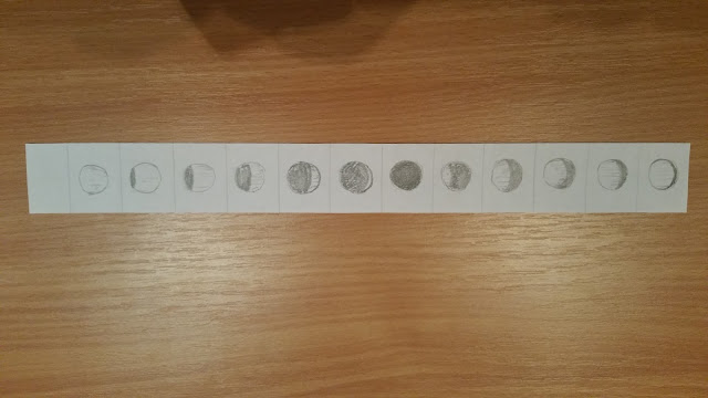
Here's my Zoetrope animation of a sphere, or the moon - whatever you see really, we'll just go with that :)
Next up we took to Flash, and I created a real gormless looking slug.
Fast forward to the following Friday, where we were tasked with morphing.
So,
Here's Broccoliface.
THAT was interesting :)
Looking forward to next Friday.
Photoshop exercise 03, 04, 05
I should have uploaded these a while back!
Friday 9 October 2015
Maya Tutorial 03
Quite enjoyed the introduction to texturing. Now I'm left thinking - what manner of robot am I going to cook up?!
Thursday 8 October 2015
Invisible Cities OGR 08/10/15
Invisible Cities
http://tromacorp.blogspot.co.uk/search?q=invisible+cities
Maya Tutorials
http://tromacorp.blogspot.co.uk/search?q=maya
Concept artists who's who
http://tromacorp.blogspot.co.uk/2015/10/concept-artist-whos-who-jean-giraud.html
Film reviews
http://tromacorp.blogspot.co.uk/search?q=review
Photoshop tutorials
http://tromacorp.blogspot.co.uk/search?q=photoshop
Tuesday 6 October 2015
Concept artist who's who: Jean Giraud.
Jean Giraud is one of the artists who've had the most impact on me during childhood, and subsequently shaping my mind, along with Chris Foss and Frank Frazetta. It was tremendously rewarding to learn that Giraud had also had a creative presence in some of my most treasured films.
Those who're unfamiliar with any of those names should definitely check them out! :)
Monday 5 October 2015
"Invisible Cities", thumbnails 24- 31
Despina - Influence maps
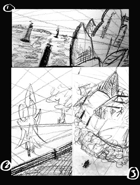
I took particular care when cultivating a definitive 'look' for Despina. Upon reading I had these evocations of this somewhat beautiful, desert jewel, that glimmered on the horizon. It brought up images from Neverending Story and Star Wars, and then as I pondered even further I started to think about ships and ruins which I think heavily influences the direction the thumbnails for Despina eventually went.
The evolution of the interior design is particularly affirming in that I feel like the fusion of shanty-esque roughness with the organic shapes presented in a middle eastern bazaar are quite compelling.
"Invisible Cities", thumbnails 9-23
This is the continuation of the Anastasia thumbnails, where I have looked at the implied class difference within the text.
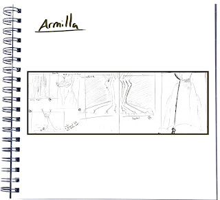
It struck me with Armilla that I could go two ways, play it very straight and look into this gargantuan city of pipework and porcelain, creating a paradise amidst an arid, almost dead landscape...
OR,
I could go in a different direction and look at an almost organic, subterranean landscape, even.
I am particularly fond of the little creature I developed to sit atop on of these pools, which were actually the Naiads, who I figured would lure travellers to an acidic bath atop the pipes in their pool, or maw.
Baucis was very reminiscent of Endor or Yavin from the star wars universe, and going back even further, Arboria from Flash Gordon.
I really liked the idea of having the structure above the clouds, as this supermassive but kind of bland shape.
Here I played with the culture of Baucis, here is a clergyman praising the sun.
I really liked the idea of having most of Baucis obscured in order to emphasise its scale, but also the unknowable within Baucis. I figured any surface dwellers viewing Baucis from afar would be afeared from the general lack of any shape save for its stalk legs and immense shadow.
Subscribe to:
Posts (Atom)


