-->

Wednesday, 8 November 2017

Arnold - Sylisation Toon Shaders & Cartoon FX, Override Sets & Stand Ins's

Stylisation Toon Shaders 

I'm really glad to know that there is a way of achieving this kind of stylized effect within Arnold. Though it seems like I'd need to have a custom texture for each segment of this object in order to retain greater control over the effect. 


Below is the node graph necessary to achieve the effect above. 


Override Sets

This technique greatly reduces render time within Arnold, in essence, being a workflow optimisation, allowing you to render out smooth without having to manually set each object's subdivision. 


Stand Ins's

Again, this is another way of reducing the amount of processing power it takes within a scene, in this case, when the need arises to display multiple instances of an object. 


Importing the exported ASS file. This file is created by selecting the object, going to "Arnold/StandIn/Export" with the object selected.


The image below perhaps best displays the power of stand ins. Rendering something like this would be incredibly intensive if the object was merely duplicated. Instead, when using stand ins, it drastically reduces the render time whilst allowing a vast amount of objects to be displayed.


Wednesday, 11 October 2017

Arnold Sessions 01

I found this selection of tutorials invaluable to understanding the differences the Arnold renderer has to offer over 2016's Mental Ray. There's a real breadth of changes which I'm still yet to decide if I'm entirely on board with. Though I must say, they have made the process of creating convincing looking skin look simpler and more intuitive, and there's no denying the sheen it adds to materials. Plus there's a lot of customisation options in there which really do invite further experimentation.


AO With Wireframe


Detective's desk with aiStandard 

In particular, the addition of a "roughness" slider in the material options really surprised me. Allowing light to react differently depending on how rough the material is in "reality", It really invites the notion that you're not simulating the materials anymore, but rather, actually using them.


Arnold Sub Surface Scatter

Friday, 19 May 2017

CG Toolkit Submission: Film Reviews, Maya Tutorials & Sculpting

World Animation Film Reviews


Lighting & Rendering

Pipeline 1: UV Layout & Maps

Pipeline 1: Spine & Skinning

Pipeline 1: Body Rigging

Pipeline 1: Facial Rigging (Part 1)

Pipeline 1: Facial Rigging (Part 2)

Sculpting Class

Dope Sheets

Pipeline 01 - Part 6: Adding Teeth & A Tongue

This is how far I've progressed with JPJ. I'm obviously retreading things I've completed in my Olga model at this point, but I want to make sure he's complete too, regardless of missing the deadline. Once he's done I'm going to go back to work on Olga to work out and residing issues. 


World Cinema - "Kubo And The Two Strings" (2016) - A review

Fig 1. 
"Kubo and the Two Strings" (2016) dir. Travis Knight, produced by Laika Studios, centering on the titular "Kubo", a young boy who leaves his distant cave (and sickly mother) to go to town and perform for it's folk every day. Events kick off when Kubo stays out late one day in order to attend the villages "Bon Festival" - a festival honouring the dead; disobeying his mothers pleas in the process, which, as it transpires, turns out to be something he should have listened to. At sunset, Kubo is attacked my his mother's ghostly sisters, as she is forced to protect him with her last ounce of magic, sending him to a distant land...and his journey's start.

Fig 2.
What makes Kubo so enthralling is it's want to dispense with quickfire editing that seems to be ever present in contemporary children's entertainment. "There is a lyrical quality to the writing, which is a refreshing alternative to the slapdash slang assault of many family films." (Ide, 2016)  Kubo makes a point of making the audience wait, and as such, shot's frequently have that alluring quality that invites the eye to inspect each and every artisinal quality the film offers. And, if anything, that's the qualifier that best suits this film, for everything is truly bespoke. Aided by a myriad of new techniques, making this a tremendously ambitious affair and Laika's (and Travis') "most ambitious project his company has attempted, pushing the envelope of 3D printing in animation to new levels" (Giardina, 2016). It's such a treat to find a film that truly delivers on what it promises, on all levels including story. And that seems to stem from Travis' somewhat omnipresence on the project. Perhaps the quality of writing stems from that? Travis himself mentions "I wanted to approach [the subject of death] with sincerity and honesty," says Knight, who suffered his own loss in 2004, when his brother died in a tragic diving accident." (Giardina, 2016) and indeed the fact that this is such a personal overall theme seems to corroborate the immense quality of the film.

Fig 3. 
Laika's previous films, "Coraline" (2009), "ParaNorman" (2012) and "Boxtrolls" (2014) all carry this quality however, and it really seems as though the studio is going from strength to strength, in fact  "Laika's first film release was 2009's Coraline, which was nominated for an Oscar and grossed $124.6 million worldwide. Its second movie, 2012's ParaNorman, also was Oscar nominated and grossed more than $100 million. Ditto its third, 2014's The Boxtrolls." (Giardina, 2016) And it's really their knack for imbuing their properties with an interesting mix of classic stop motion work (in the vein of Harryhausen) with new techniques that afford them an incredible amount of flexibility in their workflow.

The bespoke design work features incredibly attention to detail. In one sequence, where Kubo and co journey over the "Long Lake" in a ship made of leafs, the design crew mention having "to map every leaf — thousands of them, each individually laser-cut and about the size of a human thumbnail — and reproduce the exact same pattern on both ships, so they'd match from shot to shot within the film. It's a lot of effort for something most people wouldn't notice. "God knows," Pascall sighs, "there are easier ways to make movies." (Robinson, 2016) But for Laika, and certainly Knight himself, easier ways aren't as worthwhile. It seems even during this projects inception Knight knew what an undertaking it would be. Knight, " A sucker for fantasy and a fan of Japanese culture" (Giardina, 2016) admits that "I bit off more than I could chew" (Giardina, 2016) though this isn't a problem. With critics and audiences alike serving as proof that the gamble paid off.

The distinct flavour possessed here isn't wholly 'of' any particular culture, although the film's director was a self confessed fan of Japanese culture, and the story presents a melancholic and mature take on the themes of loss and acceptance that evoke the complexity and maturity on display in Studio Ghibli animations. This represents a heady mix of Japanese influences and American sensibility, though it's sensitivity and patience can definitely be ascribed to the works of Ghibli.

Fig 4.
"Kubo and the Two Strings" is a rare treat. One that is distinct and measurable based on the sheer effort poured into it. The techniques on display here coupled with attention to detail make this feature an industry benchmark, throwing up grand notions of Laika stepping up to become this generations 'Pixar'. Whatever happens from here on, the audience wins.  


Bibliography

Giardina, Carolyn. (2016) "How 'Kubo and the Two Strings' Merged Stop-Motion Animation and 3D Printing (Plus a 400-Pound Puppet)" hollywoodreporter.com At: http://www.hollywoodreporter.com/features/how-kubo-two-strings-merged-stop-motion-animation-3d-printing-a-400-pound-puppet-955406 (Accessed 20/05/17)

Ide, Wendy. (2016) "Kubo and the Two Strings review – lyrical stop-motion tale" theguardian.com At: https://www.theguardian.com/film/2016/sep/11/kubo-and-two-strings-review (Accessed 20/05/17)

Robinson, Tasha. (2016) "Inside Laika studios, where stop-motion animation goes high tech" theverge.com At: https://www.theverge.com/2016/8/18/12500814/laika-studios-behind-the-scenes-kubo-and-the-two-strings-video (Accessed 20/05/17)

Illustrations

Fig 1. Kubo Poster. [image] At: http://cdn.collider.com/wp-content/uploads/2016/04/kubo-and-the-two-strings-poster-the-far-lands.jpg (Accessed 20/05/17)

Fig 2. Kubo and Monkey. [image] At: http://www.beliefnet.com/columnists/moviemom/files/2016/08/kubo-and-monkey.jpg (Accessed 20/05/17)

Fig 3. The Sisters. [image] At: http://www.indiewire.com/wp-content/uploads/2016/08/kubo-the-sisters.jpg?w=780 (Accessed 20/05/17)

Fig 4. Kubo with wings. [image] At: http://www.rotoscopers.com/wp-content/uploads/2016/03/FB_IMG_1457541105678.jpg (Accessed 20/05/17)

World Cinema - "The Secret of Kells" (2009) - A review

Fig 1.


"The Secret of Kells" (2009) produced by Cartoon Saloon and dir. Tomm Moore & Nora Twomey and nominated for the Academy Award For Best Animated Feature is an Irish animated feature that centers on a young Monk, Brandon, living amongst the walled community of the Abbey of the Kells, under the watchful eye of his circumspect uncle, Abbot Cellach. The boy, an apprentice at the scriptorium of the monastery, hears tell of Brother Aiden and his masterwork, the - as yet - unfinished Book of Kells, becoming embroiled in the plot further when a fleeing Aiden (and feline sidekick Pangur Bán) arrives at Kells after a raid on his own settlement, sending Brandon on a quest that ultimately sees him battling darkness itself, facing up to Viking warbands, as well as befriending forest spirits and perhaps even finishing the fabled Book of Kells.

Cartoon Saloon's other films include "Song of the Sea" (2015), "Skunk Fu" (2007), "Puffin Rock" (2015) & "The Breadwinner" (2017) - to be released - ; a selection of stellar 2D animation, with Song of the Sea bearing the most similarities in terms of style, with that of The Secret of Kells. Speaking of both The Secret of Kells and Song of the Sea, Brendon Connelly, writing for Den of Geek says "One was a very good film, the other was a genuine masterpiece. Maybe Cartoon Saloon will soon become as widely known and well-loved as Pixar and Studio Ghibli." (Connelly, 2015) and it certainly seems as though the method in which Cartoon Saloon creates its properties with generates the feeling of almost studio level 'auteurship' that early Pixar films had in spades. 

Fig 2.

Roger Ebert surmises the wistfulness of the nature of this tale by reconciling it with his own experiences whilst travelling in Ireland. "The studio sent a car to ferry me and my cohort McHugh to the Dingle Peninsula. As we drove along, we crossed an old bridge and the driver said, "Leprechauns made their home under this bridge." We stopped for petrol, and I quietly said to McHugh, "He doesn't know you're Irish and is giving us the tourist treatment." "Ebert," said McHugh, "he means it." " (Ebert, 2010) He later pairs this with a discussion of the Forest Spirit present in "The Secret of Kells" commenting that "The fairy girl is quite real, as Brendan can see for himself. If there are any leprechauns, she no doubt knows them. If there are not, how does she know for sure?" (Ebert, 2010). In doing this Ebert hints at a notion, that this film presents its universe as something tangible, where myth and reality meld into something greater than the sum of its parts. Yes, monks worked on the Book of Kells, was one of them helped by a woodland spirit? No, most certainly not. But does it matter? Absolutely not.

The film derives its aesthetic from actual examples of illuminated manuscripts, and as such the style is consistent throughout as well as serving to levy limitations that keep the picture flat, albeit extremely dynamic. It is a smart choice that services the film well as it keeps things distinct and of a flavour unique to the property it is based on, and thus, uniquely Irish. This is an example of a film that derives much from its own artifice, and as such, there is a certain amount of credibility, and authenticity to this feature. Roger Ebert muses that The Secret of Kells "is a little like an illuminated manuscript itself. Just as every margin of the Book of Kells is crowded with minute and glorious decorations, so is every shot of the film filled with patterns and borders, arches and frames, do-dads and scrimshaw images. The colors are bold and bright; the drawings are simplified and 2-D. That reflects the creation of the original book in the centuries before the discovery of perspective during the Renaissance." (Ebert, 2010) and continuing this discussion, "As for the look, imagine the flat abstractions of nature found in Celtic manuscripts and jewelry coming alive on the screen.  The film has a design that sets it apart from art from other parts of the world.  It is as distinctive looking as Persian miniatures or traditional Japanese block prints." (Cohen, 2010). In acknowledging these guiding principles in the overall look of the film it is impossible for it's roots not to be felt in every watch. And that's just the imagery.

Fig 3.
The choice to source an Irish voice cast also adds to the authenticity felt here, to the extent where sometimes lines can get lost in the mix to the unfamiliar ear. Yes, accents don't give way to accessibility, for to do so would sully what is effectively a cultural curio. In essence, the fact that this is Irish is intrinsic, and something that is felt on every watch. Marking out "The Secret of Kells" as an important first feature film for this studio, perhaps having some semblance of importance that "Toy Story" (1995) held for Pixar.

Bibliography

Connelly, Brendon. (2015) "Wolfwalkers: first pics of new film" denofgeek.com At: http://www.denofgeek.com/us/movies/wolfwalkers/250459/wolfwalkers-first-pics-of-new-film (Accessed 19/05/17)

Cohen, Karl. (2010) "'The Secret of Kells' - What is this Remarkable Animated Feature?" awn.com At: https://www.awn.com/animationworld/secret-kells-what-remarkable-animated-feature (Accessed 19/05/17)

Ebert, Roger. (2010) "The Secret of Kells review" rogerebert.com. At: http://www.rogerebert.com/reviews/the-secret-of-kells-2010 (Accessed 19/05/17)

Illustrations

Fig 1. The Secret of Kells Poster. [image] At: http://www.impawards.com/2010/posters/secret_of_kells_ver2.jpg (Accessed 19/05/17)

Fig 2. The boy and the spirit. [image] At: http://cdn.collider.com/wp-content/uploads/the_secret_of_kells_movie_image-1.jpg (Accessed 19/05/17)

Fig 3. The Raid. [image] At: http://cdn.collider.com/wp-content/uploads/the_secret_of_kells_movie_image-9.jpg (Accessed 19/05/17)

Thursday, 18 May 2017

Mental Ray Part 11: Mental Ray Proxies

I can definitely see how introducing this into my workflow will help negate the drag on my processor the viewport can tend to have when working with complicated meshes. It seems extremely useful for building sets and implementing on a 'work as you go' basis in order to keep scenes less cluttered. 


Mental Ray Part 10: Motion Blur

It was quite nice learning the differences between a higher grade of motion blur and what effects it bestows on an animation, as well as the difficulties included in utilising it on an animation that contains deformation. 


Mental Ray Part 9: Ambient Occlusion

It took some time to figure out just how to switch the Legacy Render layers back on in order to achieve the last image here, but It also led me to experimenting with the current Render Setup settings, which I will continue to do in order to cultivate further skills for future versions of Maya. 


Mental Ray Part 8: Displacement Maps

I found it extremely useful to see how powerful displacement maps could be when applied to simple surfaces. It took a bit of translation between versions of Maya but I managed to complete most of this tutorial to a satisfactory level. I had trouble with the Toadstool no matter how I went about it though. 


Wednesday, 17 May 2017

Mental Ray Part 7: High Dynamic Range

I found this tutorial to be very interesting as it incorporated a lot of Photoshop techniques and practical knowledge about digital photography.  I'd always wondered how the process of match lighting was done in the first place, bar the knowledge that you need a mirror ball. So this tutorial was invaluable to me.

Also, Is that Dungeness? 


Tuesday, 16 May 2017

Mental Ray Part 6: Mia Material X Shader

During the progress of this tutorial I was struck by just how malleable the presets on these materials can be, and began to experiment with mixing different ratios to see what materials I could come up with. 


Mental Ray Part 5: Portal Lights

This rendering tutorial expanded on the physical sun and sky tools present in the last tutorial and made them applicable for an interior through the use of two area lights placed at either window to maximise the light getting inside the structure. 

Although my computer took a while with the render it was worth the wait.
First Render

Intermediary Render

Final Render

Mental Ray Part 4: Physical Sun & Sky


It was really interesting learning about this tool, especially with how versatile it ends up being. Above are two of the final renders created during the completion of this tutorial.

Mental Ray Part 2: Final Gather

I had a much better time with this tutorial, and found it went mostly smoothly. Though I had to play with the lighting settings in order to be able to see the model clearly as it ended up a bit too dark for my liking. 

Below is the final render and the settings used in the Final Gather section in the render settings. 


Lighting And Rendering 2: Samples & Quality Control

I experienced some difficulty with this tutorial as I was either using the wrong version of Mental Ray or Maya. Ultimately I had to be creative towards the end of the tutorial as I wasn't getting the same results as Alan, despite triple checking everything.


I settled on lowering the Anti-aliasing contrast in order to achieve a greater amount of blurring on the raytraced shadows as it seemed to be the only thing I could do to make them look less grainy. Below is the final render of this tutorial. 


Thursday, 11 May 2017

End of Year 2 Crit reflection

Phew.

Well, I think I expected it to go a lot worse in all honestly. I am glad that there seems to be a light at the end of the 'tunnel' I'm in.

I am most pleased that I was able to demonstrate skill in draughtsmanship as well as my technical skills in maya. I think conceptually is where my work was weakest and I can only attribute that to being torn between a few directions within the course of this project. In some ways, I wish I had stayed true to my original idea of formulating a toy campaign around a character because I was at least certain to some extent with that idea. Nonetheless, I am proud of the character I have created, and I'm really looking forward to finishing the model, including texturing and sorting out the issues I experienced with the foot controls later on in the process. There were moments during the modeling, rigging and skinning process that bore a lot of tedium and late nights, but seeing Olga come to life in front of my eyes was worth all the toil.

Adaptation B has been challenging for me, definitely in terms of putting my drawing skills into the light, and although I attested that I'm not scared of drawing, I think that simply because I am much more comfortable with other things, writing for instance, I tell myself that I will prioritize those things first. I recognize that this is a mistake. I find it almost paradoxical to be able to say "I am pleased with the amount of effort I put in to my model" because the timing was all wrong, and ideally, I should have been near completion a few weeks back. So I feel ambivalent towards today, and ambivalent towards this year in general. Though I have seen my skills increase, as well as my grades, so...in general...ambivalent.

I definitely take the comments from Phil and Alan seriously, frustratingly these are issues I see happening as they occur and yet I continue to let things like this happen, i.e. only getting my backside in gear towards the tail end of a project.

I also realise that it's a self fulfilling prophecy in not posting my work because I fear being ignored, in fact, writing that down here makes it seem all that much trite. My baggage is tripping me up on the way to the airport.

So, moving forward I'll be further pushing into the areas I feel that my skills are particularly lacking in, and trying to work on my enthusiasm, which, I must admit, after the interim crit and to an extent, the first term, has been on the wane. I am conscious of it, I am working on it. And I will continue to work on it.


Crit Post 11/05/17


Wednesday, 26 April 2017

Whatever Happened to Olga Mesmer? - Face Shapes

So again, going off of the back of the face sketch I produced previously, I began to try to work out other potential shapes, as well as trying to resolve the head shape in 3D, Below is a selection of that process, until I actually started to find a shape that was pleasing enough, and looked convincing to me. 

Where I really started to understand what I needed from the character was a little later on, particularly in the middle thumbnails below, where I also began to experiment with expressions to imbue her with a bit of sass and a certain air of the 'sardonic'.

Moving on from this though, I'll be detailing some further concept art I've produced of Olga, as well as posting some costume experimentation, replete with influence maps for the clothing choice. 

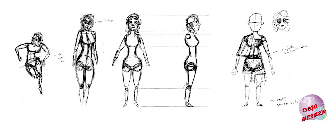
Whatever Happened to Olga Mesmer? - Developing Olga's physicality.


Based on the thumbnail I got quite enthused about last time, I set about developing shapes for the entire body. I knew, based on Olga's character, and also from her original appearance that there were a few signposts I had to adhere to. 

Namely, that Olga should still be rather spritely, despite her age. (She's immortal you know). So with that, a determined factor of 'athleticism'. I also wanted to grasp at a more naturalistic form of physical appeal. For, Olga's character came from the pages of 'Spicy Stories', I wanted to eschew her origins as a character purely for the fantasies of men, and endow her with more realistic proportions. Initially this resulted in the almost 'chibi' designs you see immediately below...


Though I came out of this as I sketched, going for a little more realistic tone in both the shapes and the features. I also had a little play-around with costumes, the one below being inspired by a few choice pieces of Norma Desmond's (see: Sunset Boulevard) wardrobe.

Ultimately this is where I'm sitting with her shape. As she's a faded starlet, I've been experimenting with different poses to try to achieve not only her weariness (from living for so long) but also that brief spark of what made her so popular in her adventures through the years (1920's-Now). The current design I'm focusing on will be how she appeared as a Heroine before she disappeared.