I still can't quite fathom digital painting, but instead of sitting there frustrated I thought it best to practice, practice, practice!
I've been watching a lot of Clone Wars recently, and from that have a growing appreciation for anything Star Wars at the moment. So I thought it fitting that I make my own attempt at a Mcquarrie!
It took about 40 minutes (which I'm sure isn't fast enough) but I can see myself improving :)
Wednesday, 30 September 2015
Saw this and thought of you...all
I stumbled blindly upon this whilst researching Metropolis.
It's a comparison piece between Metropolis and Blade Runner, might give you a sense of how far Metropolis has bled through the ages!
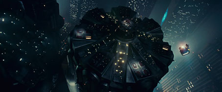
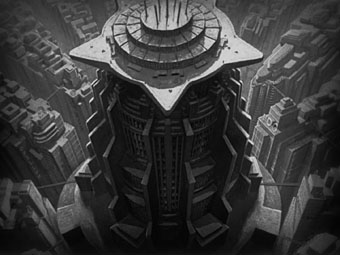
There's more things like that after the jump!
http://www.johncoulthart.com/feuilleton/2015/04/13/blade-runner-vs-metropolis/
It's a comparison piece between Metropolis and Blade Runner, might give you a sense of how far Metropolis has bled through the ages!


There's more things like that after the jump!
http://www.johncoulthart.com/feuilleton/2015/04/13/blade-runner-vs-metropolis/
"Metropolis" (1927) - A Review
 |
| Fig 1. |
These ideological quirks carry over into the art direction which is herein used in such a way as to characterise the environment; above ground scenes feature buildings hewn from stark lines and horrible almost parasitical machines slaved over by a faceless mob of workers that puts forth a sense of technological fetishism and raises questions of the relationship man has with machine, indeed "The tasks assumed by the workers are purely mechanical, needing absolutely no brain power, making them nothing more than an extension of the machine." (Citizen, 2010) . The frenetic energy present in both the editing and design creates an almost nightmarish hubbub which brings forth an interesting disparity with the serenity of the underground church where the workers go to listen to Maria, the almost de facto leader of their congregation, the dichotomy suggested within this small space is extremely important in that it parries the nightmare above with religious imagery of crosses and a myriad of organic shapes to suggest something old, and certainly before Metropolis' time, but also something holy that has only just been discovered and is therefore precious to these characters. That thought is promoted. purely by that important contrast suggested in the artistic choices alone.
Fritz Lang's "Metropolis" (1927) stands as the proud forerunner of grand dystopian science fiction as it is "Generally considered the first great science-fiction film" (Ebert, 1998) Be that from its adoption of utopian principles and visuals that ultimately give way to something more sinister, it's riffs on anti establishment ways of thinking or only for it's now tried and tested display of what a broken futuristic society looks like. This film is so ingrained and so important to science fiction today that "Metropolis" could be used as a kind of checklist against more contemporary offerings to glean certain archetypes that have carried over the years. Metropolis has it all, the failed creator; battered and broken by past tragedy, the original mad inventor, a bright new future seen in the young, shady intelligence people keeping Orwellian like tabs on particular characters. Ridley Scott certainly owes a lot to "Metropolis" whether he'd care to admit or not.
 |
| Fig 2. |
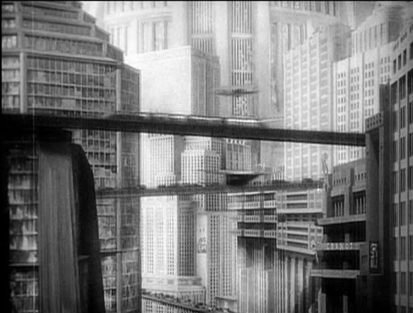
Everywhere the viewer can see, something is happening, something that helps with the scale, and enables the viewer's suspension of belief if only for a few fleeting moments. "Metropolis" is a palpable, visceral and real piece that is often diluted into lesser experiences without transference or special emphasis placed on the themes and ideas that make the original so iconic.
 |
| Fig 3. |
Bibliography
Ebert, Roger. 'Metropolis Movie Review & Film Summary (1927) | Roger Ebert'. Rogerebert.com. N.p., 1998. Web. 29 Sept. 2015.
Glancey, Jonathan. 'From Metropolis To Blade Runner: Architecture That Stole The Show'. the Guardian. N.p., 2009. Web. 29 Sept. 2015.
Vigilantcitizen.com,. 'The Occult Symbolism Of Movie "Metropolis" And It's Importance In Pop Culture'. N.p., 2010. Web. 29 Sept. 2015.
Figure 1. Metropolis (1927) [Poster] At: https://hypergrid.org/metropolis/wiki/en/images/f/f9/Metro_001.jpg (Accessed on 29.09.2015)
Ebert, Roger. 'Metropolis Movie Review & Film Summary (1927) | Roger Ebert'. Rogerebert.com. N.p., 1998. Web. 29 Sept. 2015.
Glancey, Jonathan. 'From Metropolis To Blade Runner: Architecture That Stole The Show'. the Guardian. N.p., 2009. Web. 29 Sept. 2015.
Vigilantcitizen.com,. 'The Occult Symbolism Of Movie "Metropolis" And It's Importance In Pop Culture'. N.p., 2010. Web. 29 Sept. 2015.
Illustrations
Figure 2. Metropolis (1927) [Still] At: http://www.tboake.com/dystopia/patterson/images/METROPOLIS_USA_NTSC-120.jpg (Accessed on 29.09.2015)
Figure 3. Metropolis (1927) [Still] At: https://blogger.googleusercontent.com/img/b/R29vZ2xl/AVvXsEh4nx_hUa6qVPXrR0S5HSy-VyHPv7F2uMviJOPT2jLFCiQDS2MmVcrITwXWWS8CwN-sp1Ivjo2anPeNrNR3QBbwXpxD1syUNamvEjefSwaQSYMSSiXmrIw5qP-r1LOfhHCGa82crSGU5ZY/s1600/Metropolis_041Pyxurz.jpg (Accessed on 29.09.2015)
Tuesday, 29 September 2015
Maya Tutorial 02
I really felt a sense of progress with this tutorial.
This is actually the second raygun I have made, the first one is still on the computers in DM5. I found using the deformation tools interesting, and am extremely satisfied with the look of the raygun as I strayed a little off course with it's shape and colour choice.


Monday, 28 September 2015
"Invisible Cities", Thumbnails 6-8
I began to look at the fantastical, particularly taking interest in the kites and their significance to Anastasia.
Sunday, 27 September 2015
"Invisible Cities", Thumbnails 1-5
Here's a few thumbnails focusing on the city of Anastasia.
I couldn't quite get the imagery of Meereen or King's Landing from Game of Thrones washed out of my mind when thinking about Anastasia. A place that seems to offer as much as it can take away.
In the initial sketches I stuck to more mundane aspects of the place to get a sense of perspective, and the realistic aspects of the place before moving on to more fantastical ideas, which you'll likely see in my next post.
These sketches are only notable in that they are the seed of later ideas to come.
Maya Tutorial 01
Fear not, I have not disappeared into the night!
I actually finished this tutorial a few days ago, but decided on a whim to change around my workspace at home to accommodate all of the stuff I'll need to do on the course.
I really felt myself acclimatising to the program, and after a few hours had already begun to use keyboard shortcuts, which I'm using as a measure of success.
Here's a few egg cups for your perusal.
Looking forward to the next tutorial!
Wednesday, 23 September 2015
"The Cabinet of Dr. Caligari" (1920) - A Review
| Fig 1. |
In which the bleak offering of Robert Weine encapsulates an innate dread born from the fallout of the first world war. Establishing itself as the progenitor of the soon-to-be tropes and stylistic flair of German expressionism; “The Cabinet of Dr. Caligari" (1920) posits a tale of fantastical and paranoid horror, set in an equally oppressive locale.
This paranoia is conveyed in a myriad of ways, be it the storytelling; allowing itself an air of the anti-establishment now more commonly seen in films like Terry Gilliam’s “Brazil” (1985), the almost crazed exuberance captured in the performances or perhaps most effectively, in the art direction, Featuring bizarre jagged shapes and ghast-like people that recollect an unseen violence the world on screen has endured, and further to the point, adapted to.
A huge part of “The Cabinet of Dr. Caligari”’s success stems from the atmosphere that is sustained and indeed increased to an almost palpable intensity by the twisted, roughly created (no doubt to be reflective of it’s inhabitants), almost Goya-esque sets, coupled with the unreliability of the narrator, Francis, and the claustrophobic fever like dream they both invoke. An unreliable narrator is defined by the farcical nature of their viewpoint. He or she is “lying to us, to other characters or to themselves”. (Nobile Jr, 2015) and indeed it seems that in this instance the town of Holstenwall as well as Francis himself, is subject to the same behaviour.
| Fig 2. |
The almost deliberate shabbiness of the set design is also meaningful in that it further reinforced this idea of a broken world. Noel Murray posits that “the world of The Cabinet Of Dr. Caligari is meant to resemble the world of the stage and the contents of the characters’ minds” (Murray, 2014) and with it we are being given all of the necessary information to detect that perhaps things are more askew than they initially seem from the onset.
| Fig 3. |
The perpetual gloom, stark lighting and odd circular motifs embolden the art direction and in turn, an eeriness that settles after the opening. Indeed, Kevin Kryah discusses “patterns on the walls” that “create a sharp point that echo Cesare’s entry into the room and his unsheathing of a dagger” (Kryah, 2015) evidencing the art informing the eye. This idea of a circular motif becomes important to the notion of political unrest of post war Germany, as it was a “...motif that hinted at the specter of unrest and the never-ending cycle of authoritarianism, a fear in the minds of German citizens.” (Kryah, 2015).
What makes the experience so effective is the atmosphere Weine has strived to create, not only hinting at greater sorrow beyond the limits of Holstenwall, but also in the mindset of a post war people still struggling with the way of things. That he has done this not just by sheer virtue of conventional storytelling, but in a show-don’t-tell approach based primarily on visual storytelling is only something that can be, and indeed, has been celebrated for years to come.
Bibliography
Murray, Noel. 'The Cabinet Of Dr. Caligari'. The Dissolve. N.p., 2015. Web. 22 Sept. 2015.
Kryah, Kevin. 'The Cabinet Of Dr. Caligari: Dark Relationship With Postwar Germany | The Artifice'. The-artifice.com. N.p., 2015. Web. 22 Sept. 2015.
Nobile, Phil Jr. 'Framing CALIGARI: The Unplanned Birth Of Cinema’S First Unreliable Narrator'. Birth.Movies.Death.. N.p., 2015. Web. 22 Sept. 2015.
Illustrations
Figure 1. Cabinet of Dr. Caligari (1920) [Poster] At: https://upload.wikimedia.org/wikipedia/en/3/35/Das-Cabinet-des-Dr-Caligari-poster.jpg (Accessed on 23.09.2015)
Figure 2. Cabinet of Dr. Caligari (1920) [Thumbnail] At: http://quietus_production.s3.amazonaws.com/images/articles/1003/caligari___1232121337_crop_557x375.jpg (Accessed on 23.09.2015)
Figure 3. Cabinet of Dr. Caligari (1920) [Still] At: http://www.theguardian.com/film/2014/oct/05/cabinet-of-dr-caligari-dvd-review-classic-french#img-1 (Accessed on 23.09.2015)
Monday, 21 September 2015
Photoshop Tutorial 01
Today, whilst being long, definitely gave me a better understanding of the course I've undertaken.
I'm equal parts worried, and relishing the challenge.
Anyway,
Here's my take on fruit, which was the focus of the first and second exercises tasked to us in the Photoshop portion of today.
I'll almost certainly come back to these to give them a bit more texture, and perhaps clean up the grayscale pears.
Friday, 18 September 2015
Machine Development
And finally, the last design, but by no means the least. Somewhere along the line I ended up creating a mechanized vulture, or at least, what I assume to be.
On the whole this has been a thoroughly enjoyable experience.
Now, I'm all set for tomorrow (fingers crossed).
Bring it on!
On the whole this has been a thoroughly enjoyable experience.
Now, I'm all set for tomorrow (fingers crossed).
Bring it on!
Thursday, 17 September 2015
Structure Development
Although I'm most happy with the structure thumbnails I produced for the summer project, this did mean it was hard to decide which design to progress with.
I settled on number 11. The first design in the structures experimentation.
I experienced the same apprehension at changing the shape of the initial design, merely because I was quite happy with the shape.
I think what ultimately happened is the blending of both the organic and man-made structures. I certainly feel like this could be some kind of dried up husk of a giant creature that has since been used as a form of shelter. And looking at it reminds me of something Jean Giraud (Moebius) would have produced, which I'm doubly happy with.
Creature Development
As I was already quite keen on the original design of this entity, I didn't feel the need to embellish it too much.
Indeed, I have used the original outline in the development, figuring to myself that the paramount thing was to work out what the creature would look like from the front, and additionally the way the skin of the creature would look with shadow, figuring out the dips and ebb of the skin.

You can tell I'm not a big fan of splashing too much detail, as I seem to enjoy leaving a little sense of ambiguity here and there.
Indeed, I have used the original outline in the development, figuring to myself that the paramount thing was to work out what the creature would look like from the front, and additionally the way the skin of the creature would look with shadow, figuring out the dips and ebb of the skin.

You can tell I'm not a big fan of splashing too much detail, as I seem to enjoy leaving a little sense of ambiguity here and there.
Machine Design 21-30
Having fallen behind, I think I'm going to have to make a decision and get to the development stage. Although I didn't make 101, I've enjoyed the process, and seeing the random stuff the silhouette method allowed me to create.
Here's some machines for your visual digestion.
Next up is idea development!
Wish me luck.
Here's some machines for your visual digestion.
Next up is idea development!
Wish me luck.
Monday, 14 September 2015
Structure Design 11-20
Following the last post regarding creature design, these 10 focus on structures.
I don't know if I've consciously tried to blur the lines between machine, creature and structure. But each of my designs seem to have multiple applications.
That's either a good thing or a bad thing right?
Anyway, enough jabbering.
I don't know if I've consciously tried to blur the lines between machine, creature and structure. But each of my designs seem to have multiple applications.
That's either a good thing or a bad thing right?
Anyway, enough jabbering.
 |
| 11-20 Structure designs |
 |
| 15 w/colour |
 |
| 11 w/colour |
 |
| 12 w/colour |
Wednesday, 9 September 2015
Creature design 1-10
Images 1-10 of the summer project. Here i've decided to utilise the silhouette of the given objects in order to create interesting shapes for creatures/robots/transient designs.
Subscribe to:
Comments (Atom)


