
Showing posts with label uca. Show all posts
Showing posts with label uca. Show all posts
Monday, 14 May 2018

Tuesday, 24 April 2018
Major Project - Taste - Impromptu Maya update

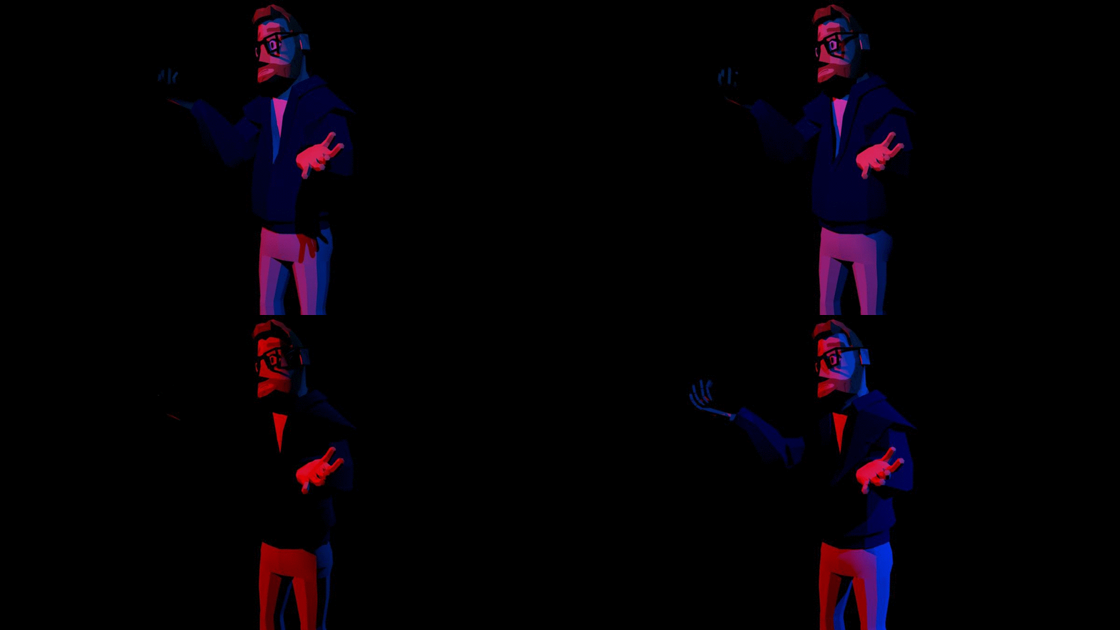
Just thought I'd post this. Finished skinning him today and decided to play around with lighting just to see how it interacts with the models hard edges. Sorry if it's a bit Lynchian, it doesn't reflect the aesthetics of the project at all. I just enjoy red and blue gel lighting in films.
Monday, 23 April 2018
Major Project - Taste - Designing Rob

This is Rob.

Fortunately, both of us have styles of clothing that are commonly associated with us, so designing a 'costume' isn't such a task. And since I'd already established the rules the art must follow whilst designing myself, it was a much faster process in designing Rob. I began again, by throwing down shapes and seeing what I felt was closer to Rob. I am fortunate that he has a lot of patience because he most certainly doesn't look like that first thumbnail. But again, as I progressed I steadily moved closer to something that I could recognize as him whilst looking like it fits with my other design. 

I then progressed to designing his clothing and build. I couldn't resist then also drawing him in a needlessly fabulous pose, like something out of Sailor Moon. But once I'd had my fun, I again resorted to the lasso tool method I'd used with my design. Of course the magic of me posting these in a linear fashion makes it seem like I'd had this realisation way before I started designing Rob, but in actuality, I was designing us and working things out in tandem, and as such, came upon that method all at once for both characters.
Shape wise, again, you'll notice that I initially draw things in a needlessly stocky or disproportionate way, and I can tell you here, that this is unintentional. Fortunately I have the gumption to carry on and fix these things in post. As you'll again see on the right.

After this design was more or less settled in my mind, I moved on to more formal orthographs for use with Maya.


Major Project - Taste - Further outfit development for Joe

After deciding that I was progressing in a direction that didn't reflect my wants for the project again, I took a different approach to drawing the shape of the body. Opting for a more angular look that would really help to create this angular look when working from the orthographics in Maya. So I employed the lasso tool and proceeded to shape the body and outfit over a series of versions. Starting in a place that was fairly abstract and straight, and ending in a place that maintained a bit of shape to the legs in particular.


Major Project - Taste - Joe development


Firstly, here's a design I forgot to include in the previous post. Again, whilst I think there's some merit here, it just felt far too 2D. Although I'm happy with the painting on the jacket, I've really been trying to improve my painting over the course and recently have changed the default brushes I've been using and found myself escaping the plateau I'd found myself in.
There was a sort-of eureka moment during the design process, where I wasn't really satisfied with my previous designs and went back to my pinterest album I'd created to gather ideas.
There was a sort-of eureka moment during the design process, where I wasn't really satisfied with my previous designs and went back to my pinterest album I'd created to gather ideas.

One illustration in particular stood out to me, featured below.


I think it was after looking at this where I really found my feet with the style I wanted to shoot for, as although there's some flatness here, it's effective, likewise the large eyes and slight "Disney" vibe they give off was really appealing to me. Leading me to draw the above image as a response. Then, sufficiently satisfied, I took the designs and began trying to work out colours that would be striking to further push the idea of a vibrant 2.5D world. Whilst doing this I also began trying to work out the side view of the characters head. Starting off very abnormal and honing it in later drawings.


I then moved on to designing a new body for the new art direction. And for some reason decided to draw incredibly thick necks. I'm still a little confused about why exactly, but as you can see, later on I began to fix the proportions in order to make myself look less like I've exclusively worked my neck out.

I decided that this style was far too 'soft' and worked on trying to achieve that rigid low poly look after this, which I'll detail in the next post.
Major Project - Taste - Initial thumbnails

Being that ultimately, the characters would end up being myself and Rob, I'd already had more than enough information in order to design us as characters. The challenge here now being if I can find a suitable art style to render us in based on the visual tenets of my influence maps. I began by detailing what exactly it was that I enjoyed most in the second character influence map.

After this, it became apparent that I still wanted to try for 3D animation, with the idea to then make the background 2D in order to compensate for the added work lent by choosing that particular pipeline. The closest picture to this particular avenue of design is the image of the girl sitting on the 2D line art rocks. I enjoy the interaction between the two planes, and how simple and effective it is, also noting how dynamic bursts of colour create interest in these simplified designs.
I began by throwing down some rough shapes in my journal. Playing on the idea of simplification, and really, just working out how it could be achieved in a way that actually looked appealing without losing the ability to impart character through expression. Some designs I like better than others, and to be honest, this was at a point where I hadn't drawn for a while (after being in the grips of the dissertation writing process). So this was very much a process of finding my feet again and recalling Justin's character design lessons, whilst also allowing myself the opportunity to play with the angular style I had chosen.

Here's the kicker, I thought I had settled on a style for a little while, and followed it through to a semi-developed state, only to change my mind right at the end of it. Ultimately I don't feel bad about it as during the process I ended up doodling something that lead to being closer to the final design I have today. I'll detail that development in a later post.


This refined design has some appeal, and really did inform design choices I made later down the line. The surviving aspects of this particular trail is the nose, which I just enjoy, despite it not looking correct in any way. I also lost the hat, which, despite being iconic, needed to go. To be quite honest, I just felt that this design was lacking in something, perhaps the eyes were a little off, or I just felt that this was a little too flat and reminiscent of a cutesy South Park.
Major Project - Taste - Character influence maps.

I knew early on that I wanted to do some form of work in 3D as opposed to making 2D rigs, but I wasn't deterred by that stipulation, still seeking out inspiration in mainly 2D areas. In many ways, I wanted to utilise a clean and simple art style that would be easy to produce, in order to test out whether this would be a viable methodology for creating perhaps weekly content if this were to become some form of "show".

It has definitely been important to me to maintain a simplistic style, but still allow for visual interest as there will need to be some complexity in order to visually engage the audience through this largely sitting conversation. This of course will be partly achieved through varying shots to keep things moving, but I also need the characters to be complex enough to carry the viewer through too.
I looked at things that varied in their complexity and largely settled on images present in this second influence map, as they retain a simplicity that still looks pleasing, as well as showcases the possibilities of 3D design that looks 2D. An idea that I later progress with.

Major Project - Taste.

As such, I've decided to go about this project non-uniformly. Employing a different (to me at least) way of assembling a script, following through to the design process of the character models, which are still very much in play even in Maya, as I've elected to follow a low-poly methodology when approaching the aesthetics that this project will have.
As such, I began this project by trying to find the format first and foremost. Beyond what I knew I wanted to reflect from My Dinner With Andre and later when I discovered Coffee and Cigarettes (2003) by Jim Jarmusch. Using the former as a way in, and the latter as a way of informing myself of what I really enjoyed about this methodology. Coffee and Cigarettes was perhaps even more influential to me, as it's style is that of the meandering conversation where two people are placed in a hyperreal setting and discuss around a topic in a dreamlike way. Less of the more brusque and direct style of podcasts that I feel lend an air of inauthenticity wherein speakers are generally prodded into saying things as a through line to generate content, which is ironic when the situations within Coffee and Cigarettes are so obviously staged themselves. Why then, do they read so authentically?
It's somewhere in those thoughts that I settled on where I felt this project should sit. On the edges of what I feel the players are actually speaking about, set within a space that is so obviously crafted, yet it will be the conversation acting as a throughline that will serve to settle the viewer into believing in what they are seeing, despite the look and feel of the low-poly designs.
Below is a cleaned up mixdown of a 2 hour conversation between myself and Robert Lindsay, where I have sought to create a conversation, piecemeal, out of varying slices of the conversation. I found that by doing things this way, it's possible to create entirely new interactions within the recordings whilst not betraying the naturalistic qualities you get from simply sitting down and talking with someone. As such, there's a distinctly low-fi feel about things which, when paired with the visuals, I feel are entirely appropriate for this piece. There's a rough objective for the recording, which ultimately boils down to being about art, elitism, taste, culture & segregation/exclusionary behaviour, but this is filtered through in a very natural and flowing way, despite the patchwork means of its creation.
The pace of this audioscript will further change in the pre-viz process when timings are altered to lend a bit more dramatic pause to the audio and the delivery of the lines, so as to belay the sometimes rushed delivery in some parts, but I am largely happy with the way that this has gone, feeling that it doesn't betray my initial criteria for this project.
Wednesday, 8 November 2017
Arnold - Sylisation Toon Shaders & Cartoon FX, Override Sets & Stand Ins's
Stylisation Toon Shaders


The image below perhaps best displays the power of stand ins. Rendering something like this would be incredibly intensive if the object was merely duplicated. Instead, when using stand ins, it drastically reduces the render time whilst allowing a vast amount of objects to be displayed.

I'm really glad to know that there is a way of achieving this kind of stylized effect within Arnold. Though it seems like I'd need to have a custom texture for each segment of this object in order to retain greater control over the effect.

Below is the node graph necessary to achieve the effect above.

Override Sets
This technique greatly reduces render time within Arnold, in essence, being a workflow optimisation, allowing you to render out smooth without having to manually set each object's subdivision.


Stand Ins's
Again, this is another way of reducing the amount of processing power it takes within a scene, in this case, when the need arises to display multiple instances of an object.

Importing the exported ASS file. This file is created by selecting the object, going to "Arnold/StandIn/Export" with the object selected.

The image below perhaps best displays the power of stand ins. Rendering something like this would be incredibly intensive if the object was merely duplicated. Instead, when using stand ins, it drastically reduces the render time whilst allowing a vast amount of objects to be displayed.

Wednesday, 11 October 2017
Arnold Sessions 01
I found this selection of tutorials invaluable to understanding the differences the Arnold renderer has to offer over 2016's Mental Ray. There's a real breadth of changes which I'm still yet to decide if I'm entirely on board with. Though I must say, they have made the process of creating convincing looking skin look simpler and more intuitive, and there's no denying the sheen it adds to materials. Plus there's a lot of customisation options in there which really do invite further experimentation.
In particular, the addition of a "roughness" slider in the material options really surprised me. Allowing light to react differently depending on how rough the material is in "reality", It really invites the notion that you're not simulating the materials anymore, but rather, actually using them.
 |
| AO With Wireframe |
 |
| Detective's desk with aiStandard |
In particular, the addition of a "roughness" slider in the material options really surprised me. Allowing light to react differently depending on how rough the material is in "reality", It really invites the notion that you're not simulating the materials anymore, but rather, actually using them.
 |
| Arnold Sub Surface Scatter |
Friday, 19 May 2017
CG Toolkit Submission: Film Reviews, Maya Tutorials & Sculpting
World Animation Film Reviews
Lighting & Rendering
Pipeline 1: UV Layout & Maps
Pipeline 1: Spine & Skinning
Pipeline 1: Body Rigging
Pipeline 1: Facial Rigging (Part 1)
Pipeline 1: Facial Rigging (Part 2)
Sculpting Class
Dope Sheets
Pipeline 01 - Part 6: Adding Teeth & A Tongue
This is how far I've progressed with JPJ. I'm obviously retreading things I've completed in my Olga model at this point, but I want to make sure he's complete too, regardless of missing the deadline. Once he's done I'm going to go back to work on Olga to work out and residing issues.

World Cinema - "Kubo And The Two Strings" (2016) - A review
 |
| Fig 1. |
 |
| Fig 2. |
 |
| Fig 3. |
The bespoke design work features incredibly attention to detail. In one sequence, where Kubo and co journey over the "Long Lake" in a ship made of leafs, the design crew mention having "to map every leaf — thousands of them, each individually laser-cut and about the size of a human thumbnail — and reproduce the exact same pattern on both ships, so they'd match from shot to shot within the film. It's a lot of effort for something most people wouldn't notice. "God knows," Pascall sighs, "there are easier ways to make movies." (Robinson, 2016) But for Laika, and certainly Knight himself, easier ways aren't as worthwhile. It seems even during this projects inception Knight knew what an undertaking it would be. Knight, " A sucker for fantasy and a fan of Japanese culture" (Giardina, 2016) admits that "I bit off more than I could chew" (Giardina, 2016) though this isn't a problem. With critics and audiences alike serving as proof that the gamble paid off.
The distinct flavour possessed here isn't wholly 'of' any particular culture, although the film's director was a self confessed fan of Japanese culture, and the story presents a melancholic and mature take on the themes of loss and acceptance that evoke the complexity and maturity on display in Studio Ghibli animations. This represents a heady mix of Japanese influences and American sensibility, though it's sensitivity and patience can definitely be ascribed to the works of Ghibli.
 |
| Fig 4. |
Bibliography
Giardina, Carolyn. (2016) "How 'Kubo and the Two Strings' Merged Stop-Motion Animation and 3D Printing (Plus a 400-Pound Puppet)" hollywoodreporter.com At: http://www.hollywoodreporter.com/features/how-kubo-two-strings-merged-stop-motion-animation-3d-printing-a-400-pound-puppet-955406 (Accessed 20/05/17)
Ide, Wendy. (2016) "Kubo and the Two Strings review – lyrical stop-motion tale" theguardian.com At: https://www.theguardian.com/film/2016/sep/11/kubo-and-two-strings-review (Accessed 20/05/17)
Robinson, Tasha. (2016) "Inside Laika studios, where stop-motion animation goes high tech" theverge.com At: https://www.theverge.com/2016/8/18/12500814/laika-studios-behind-the-scenes-kubo-and-the-two-strings-video (Accessed 20/05/17)
Illustrations
Fig 1. Kubo Poster. [image] At: http://cdn.collider.com/wp-content/uploads/2016/04/kubo-and-the-two-strings-poster-the-far-lands.jpg (Accessed 20/05/17)
Fig 2. Kubo and Monkey. [image] At: http://www.beliefnet.com/columnists/moviemom/files/2016/08/kubo-and-monkey.jpg (Accessed 20/05/17)
Fig 3. The Sisters. [image] At: http://www.indiewire.com/wp-content/uploads/2016/08/kubo-the-sisters.jpg?w=780 (Accessed 20/05/17)
Fig 4. Kubo with wings. [image] At: http://www.rotoscopers.com/wp-content/uploads/2016/03/FB_IMG_1457541105678.jpg (Accessed 20/05/17)
World Cinema - "The Secret of Kells" (2009) - A review
 |
| Fig 1. |
"The Secret of Kells" (2009) produced by Cartoon Saloon and dir. Tomm Moore & Nora Twomey and nominated for the Academy Award For Best Animated Feature is an Irish animated feature that centers on a young Monk, Brandon, living amongst the walled community of the Abbey of the Kells, under the watchful eye of his circumspect uncle, Abbot Cellach. The boy, an apprentice at the scriptorium of the monastery, hears tell of Brother Aiden and his masterwork, the - as yet - unfinished Book of Kells, becoming embroiled in the plot further when a fleeing Aiden (and feline sidekick Pangur Bán) arrives at Kells after a raid on his own settlement, sending Brandon on a quest that ultimately sees him battling darkness itself, facing up to Viking warbands, as well as befriending forest spirits and perhaps even finishing the fabled Book of Kells.
Cartoon Saloon's other films include "Song of the Sea" (2015), "Skunk Fu" (2007), "Puffin Rock" (2015) & "The Breadwinner" (2017) - to be released - ; a selection of stellar 2D animation, with Song of the Sea bearing the most similarities in terms of style, with that of The Secret of Kells. Speaking of both The Secret of Kells and Song of the Sea, Brendon Connelly, writing for Den of Geek says "One was a very good film, the other was a genuine masterpiece. Maybe Cartoon Saloon will soon become as widely known and well-loved as Pixar and Studio Ghibli." (Connelly, 2015) and it certainly seems as though the method in which Cartoon Saloon creates its properties with generates the feeling of almost studio level 'auteurship' that early Pixar films had in spades.
 |
| Fig 2. |
Roger Ebert surmises the wistfulness of the nature of this tale by reconciling it with his own experiences whilst travelling in Ireland. "The studio sent a car to ferry me and my cohort McHugh to the Dingle Peninsula. As we drove along, we crossed an old bridge and the driver said, "Leprechauns made their home under this bridge." We stopped for petrol, and I quietly said to McHugh, "He doesn't know you're Irish and is giving us the tourist treatment." "Ebert," said McHugh, "he means it." " (Ebert, 2010) He later pairs this with a discussion of the Forest Spirit present in "The Secret of Kells" commenting that "The fairy girl is quite real, as Brendan can see for himself. If there are any leprechauns, she no doubt knows them. If there are not, how does she know for sure?" (Ebert, 2010). In doing this Ebert hints at a notion, that this film presents its universe as something tangible, where myth and reality meld into something greater than the sum of its parts. Yes, monks worked on the Book of Kells, was one of them helped by a woodland spirit? No, most certainly not. But does it matter? Absolutely not.
The film derives its aesthetic from actual examples of illuminated manuscripts, and as such the style is consistent throughout as well as serving to levy limitations that keep the picture flat, albeit extremely dynamic. It is a smart choice that services the film well as it keeps things distinct and of a flavour unique to the property it is based on, and thus, uniquely Irish. This is an example of a film that derives much from its own artifice, and as such, there is a certain amount of credibility, and authenticity to this feature. Roger Ebert muses that The Secret of Kells "is a little like an illuminated manuscript itself. Just as every margin of the Book of Kells is crowded with minute and glorious decorations, so is every shot of the film filled with patterns and borders, arches and frames, do-dads and scrimshaw images. The colors are bold and bright; the drawings are simplified and 2-D. That reflects the creation of the original book in the centuries before the discovery of perspective during the Renaissance." (Ebert, 2010) and continuing this discussion, "As for the look, imagine the flat abstractions of nature found in Celtic manuscripts and jewelry coming alive on the screen. The film has a design that sets it apart from art from other parts of the world. It is as distinctive looking as Persian miniatures or traditional Japanese block prints." (Cohen, 2010). In acknowledging these guiding principles in the overall look of the film it is impossible for it's roots not to be felt in every watch. And that's just the imagery.
 |
| Fig 3. |
Bibliography
Connelly, Brendon. (2015) "Wolfwalkers: first pics of new film" denofgeek.com At: http://www.denofgeek.com/us/movies/wolfwalkers/250459/wolfwalkers-first-pics-of-new-film (Accessed 19/05/17)
Cohen, Karl. (2010) "'The Secret of Kells' - What is this Remarkable Animated Feature?" awn.com At: https://www.awn.com/animationworld/secret-kells-what-remarkable-animated-feature (Accessed 19/05/17)
Ebert, Roger. (2010) "The Secret of Kells review" rogerebert.com. At: http://www.rogerebert.com/reviews/the-secret-of-kells-2010 (Accessed 19/05/17)
Illustrations
Fig 1. The Secret of Kells Poster. [image] At: http://www.impawards.com/2010/posters/secret_of_kells_ver2.jpg (Accessed 19/05/17)
Fig 2. The boy and the spirit. [image] At: http://cdn.collider.com/wp-content/uploads/the_secret_of_kells_movie_image-1.jpg (Accessed 19/05/17)
Fig 3. The Raid. [image] At: http://cdn.collider.com/wp-content/uploads/the_secret_of_kells_movie_image-9.jpg (Accessed 19/05/17)
Subscribe to:
Posts (Atom)