
Showing posts with label Sketchbook. Show all posts
Showing posts with label Sketchbook. Show all posts
Thursday, 18 February 2016
"Ziggy" - Animatic
Here's the current animatic for "Ziggy". Really happy with this, image upscaling issues aside.
I don't know if It's a cop out by utilising "Blue Danube" for the score, initially I had put it there as a placeholder to edit to, but increasingly I found that it just worked so well that I couldn't bare to remove it.
Thoughts appreciated.
Cheers,
Crouch.
Sunday, 14 February 2016
"Ziggy" - Ziggy's space suit.


And hot on the heels of my last post, here's Ziggy's space suit!
Getting used to using the Cintiq now. Now I'll be moving onto the environment, hopefully having a portion of the space shuttle worked out by the end of today.
"Ziggy" - Grappling hook development

Not forgetting the prop that needs to be included in "Ziggy", here are some designs for the grappling hook that will eventually be used to save my heroes lives.
I'm leaning towards the simpler shapes. Imagining the devices to be quite chunky, cumbersome guns. As you can see, there are certain shapes which I have favored and as such are repeated a few times. I particularly enjoy the design of 11 and 12.
Saturday, 13 February 2016
"Ziggy" - Fuzz Space suit design.
Big news, I got myself a Cintiq.
And these are the first images I've got from it!
Yes, Fuzz and Ziggy needed space suits! So here is Fuzz's, replete with a tiny deviation from their usual design - blue stripes down the arms and legs.
The good news is that I'm finding the new tablet easier to work on. So, Ziggy's suit, The grappling hook and the environments. Big day tomorrow then :)


Thursday, 11 February 2016
"Ziggy" - Waxworks Worker design

So, working up the placeholder characters in my storyboard had proved successful with the other characters, each leading me to something different or modified from what I initially imagined, and I certainly went along this route for the Waxworks Worker. I imagined this kind of greasy teen, not particularly odious looking; instead being this "living in his Mum's basement, going out partying on the weekend, heavy metal listening" kind of guy.

So I went down that route, yet as I was drawing him I quickly grew dissatisfied with his design. And into my head popped a scruffy looking round fellow. Cheerful and unassuming. Someone content in minding his own business, kind of just waddling along as he worked. It almost felt as though I was drawing something half remembered, and as he appeared I saw fit to give him a name, which initially he would not have had.
So, here's Steve, the Waxwork guy.

"Ziggy" - Mother, colour comps.

So, all in all I'm really happy with how these have turned out, I feel like I've achieved the glee that the Mother character shows when encountering the Fuzz display. To top that off, I think I've achieved something which I wasn't capable of at the start of this course, which is to draw convincing female characters, and to an extent, draw characters at all.
So, I'm faced with 4 choices. Personally, I really like number 1, and it's how I've imagined this character looking from the start. But having said that, there's merit in the other choices too. Option 2 with the cream jumper is really evocative of the 80's in my mind. And there's something about that red jumper in number 4 too.
Decisions decisions.
Anyway, one more character to plot out after this. The ball is rolling!
Wednesday, 10 February 2016
"Ziggy" - Mother, character development
To design the boy's mother then...
I began to experiment with what sort of character I wanted the mother to look like during the storyboarding process. And after receiving feedback about it, it became clear that I had to imbue her with more aesthetics from the 80's.

So, straight off I formed a mental checklist of what that could be and came up with big hair, big jumpers, big glasses and "Mom Jeans".
The first result (the character on the left) left much to be desired, for I feel like I had created the boy's younger sister instead of his mother. So I tried again, hiding the midriff and straightening the trousers out - as well as getting rid of that sassy pose.

I felt quite happy with the addition of glasses and to a greater extent, the "big hair" - which was mainly inspired by this image.

So, I played around with the pose again, and presto!...


So, onwards to the colour comps! :)
Tuesday, 9 February 2016
"Ziggy" - Young Boy, colour comps

So, here are the colour comps I mentioned earlier. I've tried to be in-keeping with colours that recurred within my image reference library.
Choosing between them is a little tougher this time around, I feel like I'm leaning towards number 1. though.
Let me know what you think.
Cheers,
Crouch.
"Ziggy" - Young Boy, development.

So after having blocked out the main shapes for the character of the "Young Boy", I feel like I had a moment of inspiration. Imagining this little guy, who is disinterested in everything at the start of the short, I could see his face perfectly, this yawning, slightly lethargic looking sprog, almost "too cool for school". Then, I based his clothing on a couple of collected reference images.
Later on tonight I'll be cleaning the lines up further and trialing some colour comps.
Let me know what you think.
Cheers,
Crouch.
Monday, 8 February 2016
"Ziggy" - Ziggy colour comps
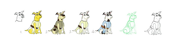
Here's the fruits of this evenings labour.
Again in Sketchbook, I've cleaned up the lines and utilised the shape method that Justin taught us a few weeks back. It really does help you draw your character, for a start, but also denote their nature.
After the sketch was cleaned up and drawn over, I created a couple of colour comps for Ziggy's possible outcomes. I myself, am a fan of number 2 and 4. The spots go a long way in cementing Ziggy's inherent scrappiness and loveable nature, and are also in-keeping with the notion that Ziggy should at least look like Laika, in part. With 4, I tried to link it with Fuzz's blue suit, but in the end, if they both end up looking like surgeons I think I'll pass on them :P
Let me know what you think anyway.
Cheers,
Crouch.
Sunday, 7 February 2016
"Ziggy" - Fuzz, Further development and Colour comps
On Phil's recommendation that I utilise tools like Sketchbook and Illustrator I've become determined to clear my linework up. Here's some more development on Fuzz, I went with shape number 5 in my previous post, as many, and myself agreed it was conveying what I wanted best.
 Firstly I experimented with Fuzz's face a little, trying to get a sense of his different expressions, particularly the ones that would be of use within the animatic. Then, I began to work on the space suit that Fuzz would wear inside the shuttle. So, to begin, I looked at reference images of Buzz Aldrin on the Apollo 11 flights and tried to apply a similar costume on the silhouette I had.
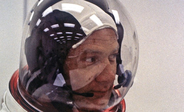


Then I began to experiment with different colour choices based on the reference images, with a couple of divergent colours thrown in for good measure. I'm quite fond of number 1 and 3 as they are in keeping within the aesthetics of the time period "Ziggy" is set in.

Any suggestions welcomed of course!
Cheers,
Crouch.
Friday, 20 November 2015
Sketchbook perspective tool practice.


This program is fantastic! I can definitely see it helping when developing compositions.
In relation to the feedback I received from the last OGR in terms of making my work busier and more dynamic, I can definitely see this tool playing a role in helping me achieve these goals.
Very cool!
Subscribe to:
Posts (Atom)